Best E-books to Learn JavaScript

JavaScript has become one of the most popular programming languages throughout the globe. Released at the end of 1995, JavaScript or ‘JS’ as called by many as an abbreviation, this programming language has soared into popularity, so much so that many major organizations are known to be devout users.

Microsoft, Netflix, Groupon, eBay, LinkedIn, Walmart, Facebook are some of the names that are known to the top industries to use JavaScript. In fact, it would hard to find the name of an organization that doesn’t use JavaScript. The only other languages that are moving alongside JS are HTML and CSS, mainly in the fundamental technologies of the internet.

With its ever-growing popularity, affinity towards learning this language has never been greater and with multiple resources, it might be hard to know where exactly to start. Much of the knowledge can be attained from going through books on JavaScript. You can also try some courses for it as well such as this tutorial to learn JavaScript for Free!

And if you are someone who shares an affinity for E-books, you can learn about JavaScript through your kindle as well. Here are our picks for the best E-books on JavaScript:

1. A Smarter Way to Learn JavaScript. The new tech-assisted approach that requires half the effort

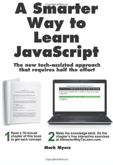
Let’s face it! When learning any new language, the greatest issue is when we try to retain that same knowledge. For French, Hebrew or Latin you have Flashcards, which helps you in revising certain words. With a heap of exercises, designed to make you retain what you have learned in every chapter, this book is designed for beginners mainly. Advanced concepts like variable scope and prototypes are hard to understand for a first-time learner. Many people may blame themselves but often it is the lack of teaching skills from the author. So, this book acts as a virtual teacher. You might not be able to land a job at Facebook or Google after reading this book, but the core concepts for beginners will be understood.

2. Eloquent JavaScript, 3rd Edition: A Modern Introduction to Programming

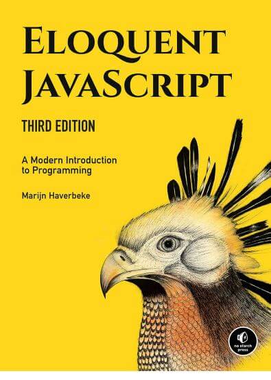
Do you want to be proficient with the language of the internet? If yes, then this book is a must for starting out. This book will help you write codes with ease but also with efficiency. A vast array of courses have been added to keep you on track to learn as many concepts of JavaScript as possible. Much like the previous editions, the author doesn’t cease teaching codes from the beginning and usage of substantial examples. With the exercises in this E-book, you will learn to write your own programs in no time.

3. JavaScript for Beginners The Simple Way to Start Programming

There are many, many courses out there that promise to teach you JavaScript. Many promises to make you proficient in the language in just a week! I am not sure how reliable they can be in terms of genuinely getting all the basics cleared. Many people are willing to any price just to get a miracle formula to ensnare all the concepts of JavaScript. 
This book isn’t like any of those miracle formulas. Instead, this book will help you discover what makes JavaScript so unique and how, to begin with, a new language? Also, you’ll learn the essential tools in JavaScript, other key languages to consider and errors you need to keep an eye out for.

4. JavaScript: The Definitive Guide: Activate Your Web Pages

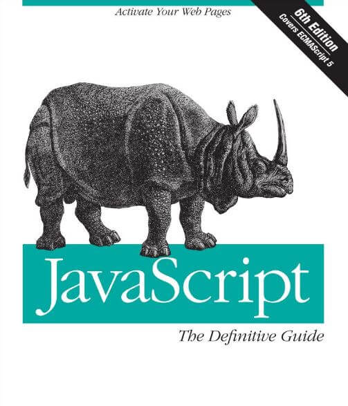
The name “O’Reilly” starts to get more visible when browsing E-books or books on a programming language. Those who are sufficiently well versed with the basics, they can use this book as an excellent guide. It is considered akin to the Bible for JavaScript by many readers. The 6th edition has many chapters that have been edited and redesigned to make the reader familiar with today’s best web development practices. It has even chapters adhering to concepts related to HTML5 and ECMAScript 5. For advanced programmers willing to learn more about JavaScript, this book is a really excellent recommendation.

5. You Don’t Know JS Series

No matter how well versed you are in JavaScript, chances are there are some concepts that might not have been covered in other books. You Don’t Know JS Series covers the trickier aspects of the language assiduously. Features and performance techniques such as Web Workers, Generators and Promises helps you create single page web applications. This book will help you explore all the old and new ways of handling asynchronous programming and understand how callbacks allow a third party controls the execution of your program. Also, you’ll use generators to async flow in a synchronous and sequential fashion.

6. Learn JavaScript VISUALLY

If you are someone who knows a little bit about HTML and CSS and now wishes to learn JavaScript, you’ll find this book incredibly helpful. Also, if you are someone who cannot focus on reading technical texts for long and need to start slow, this book needs to be added in your library. Even if you are a parent who wishes to tutor your kid for JavaScript, you can go ahead with this book. The colored illustrations help you retain a lot of the chapters since images and graphics are harder to forget compared to written chapters in black and white. This book will teach you how to read and write codes in JavaScript like any other book on the subject. But also the syntax, vital concepts, programming technology, and challenging exercises.

7. Head First JavaScript Programming: A Brain-Friendly Guide

The book entails fundamental concepts to advanced topics such as functions, objects, along with the browser’s document object model. Not just inky words but games, solving mysteries and puzzles, and innovative ways to use Java. Start building your own web applications in no time with this book! 
Learn the inner details of JavaScript and how it works with the browser. Also, get familiar with the power of functions and understand closures. The book gives a visually rich formatted design for your brain which helps you learn things a lot more easily, compared to a text-heavy book that might put you to sleep.

8. Effective JavaScript: 68 Specific Ways to Harness the Power of JavaScript

This book teaches the best practices and design. Even though being considered as a primitive book, most of the content is still useful to the developer community. With solid examples, 68 proven approaches help you in creating better JavaScript. To master JavaScript, you need to learn how to utilize the flexibility of the language and how to avoid its pitfalls.

Final Thoughts

There is no denying that JavaScript has made a universal present with few companies in the world existing without its uses. These books will surely serve as one of the best mediums to gain extensive knowledge about JavaScript. 
However, if you feel you have covered the fundamentals of JavaScript and you would need extra help to learn the more advanced versions of JavaScript, you can try out this tutorial of Advanced JavaScript for beginners.

Also, if you feel like we have missed some other popular E-books for learning JavaScript, feel free to share them with us in the comment section below.

What is CRM and why every Business needs it

“Do what you do so well they will want to see it again, and bring their friends”, said Walt Disney.

From product-centric to customer-centric mindset, whether your business is in traditional fields such as energy exploitation and agriculture production or in newly emerging fields such as e-commerce and ride-hailing, customer service has more and more been proven to be the key of a business’ longevity. The unwritten secret to success is to treat all customers as if your world revolves around them.

Staff members who have the privilege to meet customers face-to-face in your company such as market researchers, salespeople and PR executives could spend thousands of hours approaching, connecting and maintaining a relationship with your business’ customers.

Each file of a customer, including basic information their name, age, gender, education, career choice, likes and dislikes, geographic location and past encounters with your company, adds up to a gigantic database that is more valuable to your business strategy than anything else. You cannot understand your customers any better without your hard-earned database.

As a result, the organization of your database – how you manage to store and gain access to such data – is the hinge of your business understanding towards your dear customers. How to efficiently and effectively manage your customer database and customer relationship? The answer lies in CRM.

What is CRM

CRM stands for customer relationship management. CRM is a software system solution that gives business owners the freedom of managing and processing customer data so as to maintain your relationship with a large number of customers and to fetch customer insights that would further improve customer service.

Majority of market leaders chose to have their own CRM system customized for their company based on their unique demand instead of choosing a pre-built CRM platform since each business possesses different issues and organizational structures.

A CRM system built per request is beneficial to a business due to security reasons since it is a must to protect the confidentiality of customer data. A well-respected business is a business who pays great attention to customer private information and commits to not revealing such discreet information for profit reasons.

Unilever: The market leader had their own CRM system tailored named SAP CRM, which allows them to improve call center’s quick response and problem-solving.

”It enables faster response time to queries and needs raised by consumers, provides for effective maintenance of customer database, and gives easy access to customer information for analysis and strategy development”, Efren Samonte Commercial Director, Unilever Philippines asserted.

Zara: The ‘hotshot’ Europe-based fast fashion brand utilized their custom-made CRM to track customer preferences and sales. Each customer who ever made a transaction with Zara would have a profile including their birthday, phone number and past purchases. This makes maintaining a close relationship with customers’ super smooth for Zara since fashion buying is about understanding customers’ needs as if you – a business owner – is their close friend.

Zara’s CRM system was developed with a new feature called digital assistants or DAs which store customer input and allow designers to map out next season’s style and rebuy existing orders based on customers’ request.

Amazon: The e-commerce giant selected an Oracle-provided CRM system that specialises in customising the micromanaging data of each customer, setting up automated personalised marketing newsletters to each customer with recommended purchases, expanding purchase panel with more items that might be of customers’ interests, saving cache so that customers could avoid the hassle of re-logging personal information at every check out and customizing the interface of customer feedback segment.

How to choose the right CRM system for your business?

No matter what scale your business is, bear in mind what the best is for your business’ operations and progress tracking on a daily basis. We would like to give you some pointers in choosing the right CRM platform for your business.

Easy to use

Let’s be real. The ideal situation is all of your staff members come from the same or similar educational background and possess similar work performance, showing the same adaptability to new systems. Training time to get used a management system is also counted as the amount of investment you spend on a new project. So the less training time the better as long as your employees are fully ready and thoroughly understand the new system.

Mobile accessibility

A study on the difference between the usage in mobile applications and other smart devices in 2016 and 2017 featured on Harvard Business Review on May 1st, 2008 revealed a remarkable increase in visits from mobile devices (57% to 63%) and time on site from mobile devices (40% to 49%) over the course of a single year.

In addition, traffic from mobile devices reported rising swiftly from 2016 to 2018, respectively from 40% in 2016, 51% in 2017 and a full two-thirds of all traffic by the end of 2018.

Mobile access makes it easier to carry work tasks on the go and minimize the time of task response and problem-solving duration from the minute a complaint from a customer is filed till the problem is completely solved with the service satisfaction achieved.

Analytics

Nobody should invest a large amount of budget on a platform that only stores data and keeps it safe. Microsoft Excel can help you with that thanks to its thousands of convenient calculating features.

An efficient CRM system must be able to carry out more than that. It must possess the ability to cleverly gather, consolidate, analyze and extract analytical reports that can help you unveil helpful customer insights, trends, patterns and help you predict the outcome of your upcoming campaigns or suggest you take up a new marketing trend that suits your customers’ preferences.

Real-time data tracking

A mantra to chant every day as a business owner – Time management in business management is financial management. Managing time effectively is the smartest way of budget allocation. An instant report on the current performance of your campaigns on two separate niche markets can be generated on the spot if you adopt a custom-made CRM system.

The majority of e-commerce start-ups that are based in Ho Chi Minh City has acquired the real-time tracking feature, showing the performance of your campaigns and real-time interaction with the users, e.g: through visits, clicks, hyperlink clicks, likes, comments, time spent on site, etc… No better way to keep your customers close and your competitors even closer than keep tracking of the operation at any second.

Customization

“Walking on water and developing software from a specification are easy if both are frozen” – Edward V. Berard.

Each business entity functions as a whole person, therefore the business personality has to be flaunted in a suitable way that helps the system users relatable to the platform they will use on a daily basis.

Customization lies not only in sleek and chic interface design of the new CRM system but also in the entire user experience. The best service for your customers must come from a team of people who have the best “user experience” themselves. You need to have a taste of your own services in order to provide one for others.

How to build your CRM? Pre-built platforms vs. Custom-built system

Had a special idea for your own CRM system in your mind but not sure how to pull it off? Here are top 5 suggestions of CRM building tools.

Subscription fee of CRM systems

While bouncing off decisions whether to choose a pre-built or a custom-developed CRM system, bear in mind that not every pre-built CRM tool suits your requirements for a new system such as real-time data tracking, overall statistics reports and internal communication among company employees.

Especially if you are planning to have a new CRM system fully equipped for the complexity of workflow in a medium- and large-scale company, it is strongly advised you seek professional help from a software development company and work closely alongside a team of designers and developers until the final product is born.

That being the case, you can totally negotiate the pricing plan with a software development company since your desired CRM tool would only require specific features.

This, in turn, would be more economical than you might think, considering the fact pre-developed CRM tools can lure users into their 30-day free trial following a surprisingly low-budgeted pricing strategy providing abundant features that are not in your interest.
Adopting a new CRM system could be overwhelming if you have no clear objective set beforehand and a budget plan for this type of investment. Having observed the current marketing trends and consumer behavior, people at Designveloper offers insights into the upcoming trends in CRM.

5 Simple tips to hire the right App Developer

There is no doubt that almost every business nowadays has a mobile app. If you don’t, oh dear, you are missing out enormous opportunities to boost your productivity. In fact, developing an app for your business is not an activity of amusement anymore, it’s a must. That’s because today’s customer are mainly depended on smartphones to do their daily business tasks.

Related: Five Benefits Of Custom Application Development For Your Business

The thing is that finding a developer you are confident and comfortable working with can be a horror story, time-consuming task. And if you don’t make a right choice, you can end up wasting lots of money for an app that doesn’t satisfy your business requirement and not match the way you wish to operate.

If you’re at that phase, no matter which direction you choose to go, here are 5 key points that you should keep in mind. It’s not only to help you better evaluate your potential developers, but also to deepen your understanding of what’s best for you and your business.

Choose a candidate with experience

The first and foremost thing you need to do while hiring an app developer is requesting a portfolio of their apps they have built so far.

It’s not just for evaluating them, also for you to make sure you can hire the right one who had experienced in relevant field.Because if you don’t, imagine bringing on a developer with years of experience in building Android apps to develop an iOS app, how terrible!

Besides, when evaluating the portfolios of developers, here are a few questions you need to highly consider:

  • What kind of applications they have built? (yup, I have mentioned above how important it is)
  • On which mobile platform they have been creating the most mobile apps?
  • What the clients said about their works?

Start with a small talk

If developers don’t know what purpose that your app should serve, they can not create an effective one for you. That’s why communication becomes a thing of matter.

You need to clearly specify all the details of your project and watch the developer’s reactions closely to find out whether they have interest in your business or not. Because if they don’t, they may not give their best innovative ideas that they could.

The more you communicate with each other, the smoother the process will go, which consequently results in getting the preferred outcome.

Do check the developer’s technical skills

Developing a mobile app might require various tools, technologies & platforms. Make sure that the developer is familiar with all these.

However, please kindly note that fluency in an impressive number of program won’t make or break that developer. The one with an eagerness to learn will always serve you better.

Related: 6 Common Mistakes Can Kill Your App

Make sure the prices

You wouldn’t buy a car without knowing how much it costs, right?

Every developer has their different pricing structure, so what you should ask is whether it’s a flat project price or hourly rate is used. The most important thing is that you have to know exactly what you’re paying for. Asking for an detailed list of deliverables included in the price is the only way to get clear about how much your app’s actually going to cost you.

However, do not let the price drives you. You have to know that an app is always a long-term investment in your business and future, and therefore should be treated as such. If you are looking for someone offering cheaper quote, your app will look cheap as well. Whatever you are thinking, think bigger. Let’s imagine where you will see your business in next few years with that app.

Hire an offshore development company

If you have a tight budget, hiring a native app developer sometimes can turn out to be too expensive. In that case, offshoring your app is a good idea to get it build at affordable prices.

It doesn’t mean that you are compromising with quality to save a few dollars. It’s just about filling your team with talent people all around the world.

Final words

Building a simple mobile app might be a child’s play, but a seamless one takes complex programming. It takes time and practice to produce a “be-you” product which attains the quality online presence your brand deserves, not just a rushed creation from a dull off-the-shelf applications.

Deciding to hire a suitable developer to create a flawless app for your business can be a daunting decision. I hope that my blogpost helped you to relieve that stress a little bit.

Also, if you have any question regarding outsourcing your applications, please don’t hesitate to contact Designveloper. That’s something we can definitely help you!

6 Common mistakes can kill your App

I know it sounds ridiculous but more people in this world own smartphones than toothbrushes. They have became a vital part of our life.

But, have you ever wondered why they’re so popular like that? The real heroes standing behind such success are the many exciting apps smartphones provide us. These apps seems to be everything surrounding us from doing business, checking email, shopping or even playing game.

Related: 5 Benefits Of Custom Application Development For Your Business

Nonetheless, creating a rock star application is not an easy task. In fact, it can takes weeks or even months to build an app, but just a little feature can still make or break that app.

Therefore, in today’s post, I’m going to bring to you a list of some common mistakes when designing an application which prevent your advance. Those simple stupid mistakes and overlooked components can be a huge detriment to your application and can send your users to your competitors’ app. Be vigilant!

You got it all wrong in the first place

 You never get a second chance to make a first impression

How many times do I need to repeat that saying?

Usually users don’t really know what they will experience in the first moment they open an app. That time will determine whether they should trust you application or not, or if they’ll fall in love and stick with it. That’s why a fantastic app should make a good first impression.

Not only should the app load quickly and easy to understand, but also it should remind users of the reason they downloaded the app. If you don’t wow users with the first run experience, chances are they won’t interact with it again.

You forgot about fat fingers!

I don’t know about you but nothing drives me crazy more than putting so much effort into just tapping a small touch button. That doesn’t necessarily mean I have fat fingers, it’s just because I (and most people in the world) generally use the pads of the fingers to touch a button and not the fingertips.

You don’t have to design a very big touch button to avoiding this issue, just ensure that there is plenty of space around each button and make it tappable. What I mean is wherever you hit in that tappable area, it can still take you to the same location. This totally makes the app more user-friendly.

You put too much things on the screen

Sometimes, less is more. With mobile application, everything should be made as simple as possible for the users. Since apps are designed to work on small screens, there’s not so much room for you to clutter up anyway.

Also, you shouldn’t pack too many features into an app. Each app is downloaded to serve a certain purpose. If you try to stuff tons of content and other design elements, the app becomes overwhelming and too distracting to the users. Moreover, honest to say, in the world that people seem to be bombarded with too much content, they tend to be attracted by the simplicity.

Related: Design Trends Will Take Over In 2017

Users are not able to decipher the app

People always want to be heard, seen or listened to. So, there is no doubt that if you design an app that is not easy to interact with, they won’t spend much time per their visit.

Your app should be intuitive by including some visual clues so that the users can understand exactly what actions you want them to take or where to touch, what will happen next.

Lack of consistency

Let’s picture a little scenario: Your application has different color, typography and navigation patterns for each page. You think this will make your app stand out. I’m sorry to burst your bubble but just one word can describe such app – Confusing!. Another word? – Chaos!

Everything within a single app that aren’t consistent often yields frustrated users and can be the main reason driving even the most promising products to failure. Also, it’s not just about consistency. It must be a wise consistency which does more than looking the same.
Related: The Most Useful Tools For Designers

Build once, run forever

Really? This is the killer!

Many people have this silly assumption! They think that once their app is built, it never need to be touched again and their job is done. Remember, time flies fast. Things change. People changes. No matter how awesome your app is, no one is going to be interested in it forever if it’s still the same with the passing of time.

To avoid looking outdated and old-fashioned, your app needs to be updated regularly. Additionally, updated content encourage people to return to check out something new. So don’t be a conservative one that get left behind by not changing.

Do you have anything else to add?

These are just a few common mistakes of ton of misconceptions out there in the application design industry. Do you have anything else to add? I would love to know what kind of misconceptions you have met in your creative journey.

And if you are serious in getting an application for your business, you will need to consider engaging a professional agency. It will save your valuable time which you can use to improve your business processes and your products.

7 Essential Rules Of UI Design You Better Remember

Just like any other creative fields, the world of design is always evolving with the passing of time. So even if you consider yourself to be an expert designer, there’s still so much to learn and focus on to stay ahead the competitions and meet your clients’ expectations.

To step up your design game a little bit, I would love to bring to you 7 important rules of user interface design that you better remember:

Get to know your users

This is the most important thing to be considered first. If the designer can’t determine their target audience, they can not create an effective one.

Who are your users – inside and out? What do they need? What will stand in the way of them achieving their goals? Don’t stop at knowing what your users want.

To do that, you are going to need to take some time to speak with your users face to face. Even better, watching them use your product, then asking how they think about it.

Think about how people use your interface

Tapping a button, swiping a card or dragging and dropping an item with a fingertip? What ways do you want your users to do? Let’s think about it first before you design your interface.

Once you defined who your users are and how they interact with your interface, it’s time to build some cool things.

Clarity is job #1

People want convenience, not a challenge. Because of this, please do your users a favor: Make everything as clear and simple as possible to understand. Don’t make them guess.

When people use your interface, they must be able to recognize what it is, understand how to use it and know what will happen when they use it.

Some says that they want to design their interface more mysterious to make people curious. Yes, it’s totally okay, even great, but remember there is no room for confusion.

Design with multiple screen sizes in mind

There’s no one-size-fits-all design for every device in the market. When it comes to designing a website or an app, you need to make sure that you design with all screen sizes in mind. That’s because people nowadays spend a lot of their time on mobile devices from doing business, checking email, shopping or even playing game.

According to a study from Google “What User Want Most From Mobile Sites Today?”, when users visited a mobile-friendly site, 74% of them said that they were more likely to return to that site in the future and 67% of them were more likely to buy on that site’s products or services.

It’s incredible frustrating to try to zoom in and out, up and down, left and right on smaller device to read content. That’s obviously the last thing a customer wants when they are on the move and need to find out about your business.

Therefore, if your design is not accommodating this change, visitors will hit the “Back” button without regret.

Consistency always matters

Consistency makes your interface easier to use, because visitors don’t have to learn new tricks as they move around. When someone or something behaves consistently with our expectations we feel like we have a good relationship with it. The same can be said as a consistent interface. Elements that behave the same should look the same.

Don’t make things so complicated. Keep your creativity for higher order concerns.

If my words do not convince you enough, consider this: According to the Principle of Least Surprise which applies to user interface and software design: “If a necessary feature has a high astonishment factor, it may be necessary to redesign the feature.”

Design for the zero stage

The first time users experience with your interface is the most crucial moment. In order to help your users get to know your interface immediately, it is best to design for the zero state that means the state in which nothing has yet occurred.

This stage should provide users direction and guidance. Once people understand the rules, they will easily find a clear path that leads them to what they are looking for.

Keep users in control

People always want to be the one who decide what happens next when they use a interface. They feel more comfortable when they are in control of everything. If they are instantly bombarded with an unplanned interaction or confusing pathways without their consent, they tend to leave immediately.

Therefore, always keep users in control by describing clearly causation or telling them what to expect at every turn. Even though you think it states the obvious, oh dear at least you did state, you have nothing to lose but a chance to win.

Ready to rock?

Not all of these rules may be useful for your business, but it’s always beneficial to know what’s foundation to rely on in the industry.

As Picasso said: “Learn the rules like a pro so you can break them like an artist.” So why don’t you get your hand dirty, make your own stunning interface by testing and experimenting, and then share it with me in the comment box? Who knows, you might make a new rule by yourself?

By now, you have already known why having a strong website is important for your business. It isn’t just for fun anymore. Just one glance at your site, prospects can decide whether or not they should work with you. Or website is simply a place where customers are able to find you online.

However, many people misunderstood that a strong website is just a pretty one. Oh honey, you don’t need a BEAUTIFUL website, you need an EFFECTIVE one. The one that you can actually put to work.

How to put your website to work

  1. Step one is do the thing I tell you to do nearly every article I write….wait for it…THINK ABOUT YOURSELF. This is the most important thing to be considered. If can’t be sure what purpose that your website should serve, you can not create an effective one. To do that, you are going to need to take some time to think about who you are, and what the core values of your business are. How could you change your business by changing your website? How can your website make you business easier to run and for your clients or prospects to engage with you?
  2. Then, FIND OUT YOUR TARGET AUDIENCE. Along with you business goal, you need to determine your target market. Who will visit your site? What do they want to get from your site? What would make it easier for them to do business with you?
  3. JUST DO IT. I know it’s not easy to sit down, asking yourself something that are rather vague. But, just try to do it anyway. It may be the thing that makes your business great.

Next, I’m going to tell you some elements that your need to improve to make your website work for you

Call to action (CTA)

What exactly is it that you would like your potential customers to do when they browse your website? Do you want more newsletter subscribers, make a sale, provide information or gather contact information?

Then include buttons which should be of a contrasting color and say exactly what you want them to do: Call Me, Shop Now, Contact Us, Let’s Chat, Sign Up, Buy Now.

Take this stunning website which is one of our successful products as an example, its CTA is very obvious and strong. See full website at: luminpdf.com
A successful website must have ability to convert visitors quickly into customers. So make your CTA as clear and as easy for potential clients as possible to take the next step.

About us

Where to sell your story? Yes, no place else but the “About us” page. The thing is many people seems not to be aware of its importance. The “About Us” page is usually their second thought. But let me unveil a secret, that page is one of the most visited pages on a successful website!

Therefore, it’s time for you to put some effort into making the “About us” page less boring. Do not write long essay, just keep the page simple; give users just enough information. And remember it should be personal, compelling, and definitely up to date.

Contact Information

I don’t know about you, but nothing drives me nuts more than a website that makes me revisit their pages so many times to find out how to contact to them. Hey, I found your site, I like it enough to stay and I want to do business with you, but guess what? I can not find your contact information. Are you serious?

So, please display your contact information on every page if possible. It should be RIGHT-THERE. You should also offer various options for potential customers to get in touch with you such as: your email, your phone number or a contact form. A good way to do this is add contact information to all static headers and footers.

Responsive design

There is no doubt that it’s the age of mobile devices now. Mobile seems to become everything surrounding us from doing business, checking email, shopping or even playing game. Because of that insanely increase of mobile devices, it’s a must for any kind of business to have a website that is responsive.

When I make the browser thinner and wider, the layout magically adjusts itself to fit any sizes of the browser. That is how responsive websites work!

Check out: 5 Compelling Reasons Your Website Should Be Responsive

A website which isn’t optimized to be viewed onto a mobile means the page won’t be adjusted or fit onto the small screen. So, your visitors have to zoom in and out, up and down, left and right on smaller device to read content. That’s obviously the last thing a customer wants when they are on the move and need to find out about your business.

Simple navigation

If you want to stand out from the crowd, a good navigation is the key factor you need to take care of. Navigation isn’t necessary to be complicated. It should be easy to identify and easy to use.

Remember, people want convenience, not a challenge. The easier it is for people to use and navigate throughout your site, the longer they are likely to interact with it.

Fast loading page

According to Hosting Facts, “A single second delay in your website loading time can result in a 7% loss in conversion, and 40% of web users will abandon a website if it takes longer than 3 seconds to load”.

Here are other Reasons Why Visitors Leave Your Website In 10 Seconds

Slow loading pages may be a major reason why your visitors hit the “Back” button without regret. Nobody likes waiting for so long! There are tons of other options available out there, why would they waste their time waiting for your page to load?

Relevant content

A good website is the one that not only work effectively, but also provide relevant content that your audience want. Content have to cater to the needs of the users. It should answers questions that have been posed by your audience. Once your customers have found what they have looked for, they are likely to return your site to find answers for any further problems.

Last but not least, make sure all content is SEO optimized using relevant keywords so your targeted audience can find your site.

Final thoughts

I’m sure by now you’re getting the picture. A website that works for you will not only save you time, but also make you money.

It takes time and practice to produce a “be-you” website which attains the quality online presence your brand deserves, not just a rushed creation from a dull template.

 While your website essentially represents your business’s face, why don’t you take time to make it shine! Want help getting your website to sparkle? Talk to our team to see just what we can do for you!

Best icon fonts that Web Designers can not ignore

When it comes to building applications and websites nowadays, you can’t avoid mentioning icon font. They own tons of amazing benefits like:

  • easily scalable
  • lesser http requests compared to images
  • stylable with CSS (change size, color, etc)

Like normal fonts, icon fonts are available for free or for a fee. If you’re looking for 100% free icon fonts for your website, here is a list of best 7.

Octicons

If you want a simple, lightweight icon font, Octicons will be your best choice. Created by GitHub, it now offers a free set of 163 solid colored icon fonts.This icon pack is currently in version 5.0 and totally free.
Download here

Entypo

When it comes to freebies, Entypo will be top of the line. Entypo contains 411 carefully crafted premium pictograms which created by Daniel BruceEspecially, it includes a social extension if you need icons for social networks.
Download here

Iconmoon

Available as both a website and an app, IcoMoon offers 490 different vector icons for you to play around with. Each icon pack features detailed licensing so that designers and developers know exactly how icons can be used.
Download here

Typicons

You might not know about Typicons yet cause it’s not so popular. However, there is no doubt that it’s one of the better icon web fonts available.It offers a set of 336 rounded vector icons.
Download here

Font Awesome

Created by Dave Gandy, Font Awesome is by far one of the safest icon sets you can use. It has been around for years and there’s no reason it will fade away soon.

It offers 585 downloadable free fonts on their website which come in various shapes, including line art and rounded images.

Download here

Ionicons

I highly recommend Ionicons for newbies who have known nothing about icon fonts before. Because those icon fonts are pretty easy to setup. And then once you become an expert in how they work, you can move onto almost any other icon webfont out there.

It offers about 730 fonts.

Download here

Capital Icon

Created by designer Mario del Valle. Captain Icon owns amazing icon pack in which each icon has a very unique design. Which makes them stand out from the crowd is that they’re all hand drawn from scratch.

Download here

Your turn

As you can tell, there’s a ton of free icon font out there for you to choose. This is my favorite list. How about you? Did you have any “I can’t believe you didn’t put it on your top” resources? Feel free to share your secret weapon in the comments below!

Basic UX/UI Terms Everyone Should Know

Have you ever been in a situation where you knew what you wanted your product to look like, but you had no idea how to communicate with the design agency what you meant in designer-speak? It felt like foreign language, didn’t it?

Pretty much every job has its own language or set of terms that those working in that field use on an everyday level, whether it’s being a doctor, a lawyer or a designer. However, this can be quite a challenge for clients who are not involved in the design industry. So, that’s why we’re here – make thing easier.

In case you want to be more prepared as you meet prospective agencies, I’ve compiled some of the most common UX/UI terminologies to help you make sure you are speaking the same language with designers.

First, let’s make clear what’s different between UX and UI:

  • UX (User experience) : UX focuses on the human interaction with the computer or device.
  • UI (User Interface): The user interface is simply how a user interacts with the design on a page.

Okay, it’s time to find out others. Let’s scroll!

A/B testing

At its core, A/B testing is exactly what it sounds like: You take two versions of a product , and present them side by side to a group of users, to determine which one performs better and which one the users likes more.

Breadcrumb

Breadcrumbs are a navigation trail that show users where they have been on your website. Taking a website which has a lot of pages as an example, breadcrumb navigation in this case can greatly enhance the way users find their way around.

Call to Action

It’s a term used for describing specific texts, images, banners or buttons that encourage the reader or viewer of a website to take an expected, predetermined action.

Simple examples include: “Click here” or “Buy now”.

Conversion

This term is used to describe when visitors take whatever action that you want them to make such as: completing a web form, submitting a request for information, subscribing to a newsletter or making an e-commerce purchase.

Flat Design

This is a design philosophy that focuses on clean and minimalist styles. Quite literally, flat means design that has no dimensional depth. Instead of designing elements that look like you can reach out and grab them, flat design goes back to the basics of graphics – bright colors, primitive shapes, icons, etc.

Information Architecture

It refers to the organization of the information, dealing with what pages go where in a website’s structure, what content is contained on each page and how each of these interact with other pages within the site

Landing page

In the purest sense, a landing page is any web page that a visitor can arrive at or “land” on. Oftentimes, a special landing page is designed for a specific business purpose (usually in connection with an advertising or marketing campaign)

Micro-interaction

Let’s have a look at this example:. When you see the red and white box icon on Facebook, you automatically know that you have a new message and immediately click on it to read messages. That’s micro-interactions.

Micro-interactions make devices more human-like in their moments. As a result, the design is more usable and enjoyable.

Prototype

Many people cannot distinguish prototype from wireframe. Look at it this way: Wireframe is just a low detailed presentation of a product, but prototype is a medium or highly detailed representation of the final product.

It’s the sample model of the product that gives the ability to test it and see if the solutions and decisions made about the product are efficient.

Personas

A persona is a profile of your one ideal customer. It is usually a fictional character created based on your user research and interview data.

Responsive Design

Responsive design creates the layout magically adjusts itself to fit any sizes of the screen, whether desktop, mobile or smart phone.
Check it out: 5 Compelling Reasons Why Your Website Should Be Responsive

White Space

White space is also called called negative space. It’s the blank space that surrounds text, images or other parts of the page. One more thing adding, white space is not necessarily white but uses the background color of the site.

Wireframe

In short, wireframe is a skeleton of you app or product. As I mentioned above, it’s a low detailed presentation of a design – no images, no content, no interactive elements. It’s like your website blueprint. Designers will take the main group of content that you want and lay it out exactly as it will be on your product.

Conclusion

That’s a look at some of the more common UX/UI terms you’ll see in the design world. Now you’re practically a designer, right? Just kidding! But guess what? You are totally ready for your meetings with a design agency!

By no means is this the be-all-end-all of web design terminology… so feel free to add your own glossary in the comments as well.

6 Things that make or break your Website

 Have you ever heard about the saying: “The devil is in the details”?

I bet you did.

When it comes to building a website, this quote still remain true. It can take weeks to finish, cost a fortune, and there are still at least half a dozen considerations that we didn’t fully think through before work gets started. And then, at the end of the day it’s those smallest things that make or break our website.

Even though every designer might have their different plans, there are items that they should (and shouldn’t) be doing during their website design process.

So today I want to go over 6 things you need to keep an eyes on if you don’t want to send your visitors to your competitors’ sites. Be vigilant!

Make proper use of white space

Just because there is white space doesn’t mean you have to cram a bunch of shit in there

Do you like being yelled? No one does! That’s actually a “stuff all you can” website does to visitors! You don’t want to clutter up your website to the point that scares everyone away, do you? Visitors will be very overwhelmed if you cover every inch of your site with haphazard content. So, please leave your site some space to breath!

Also, 2017 is about minimalism and simplicity. It’s a must to incorporating white space into your website for a cleaner look overall and helping visitors to recognize what the most important information you want them to know is.

Bad photos can kill your website

A picture is worth a thousand words. They can help you attract visitors, grab their interest and keep them stay on your website.

Then, imagine if the first thing potential visitors see when they reach your site is unprofessional photos, they’re probably going to click back button without regret. Okay, you might be an expert in your field, but if your photography doesn’t reflect that, no one will stick around long enough to find out.

Don’t spend thousands of dollars on a website design and then ruin it with photos that don’t match your brand, or poor quality photos.

Do not complicate your website’s navigation

Imagine what will happen if you walk for hours in the forest without a compass or a map? It feel daunting, doesn’t it? The same can be said as a website with a confusing navigation.

Check out: Is Your Website’s Navigation Perfect?

I do not know about you, but nothing drives me nuts more than accessing a website that I cannot know what to expect clicking a link, or how to easily find what I am looking for.

So please do your visitors a favor. Make your website’s navigation prominent and legible for them to easily understand from the first moment they arrives at your website.

At a glance, visitors should know they are at the right place and how to get to where they want to be. For instance, the main menu should be designed to contrast against everything else so that your visitor’s eyes can be easily drawn to it.

Remember, people want convenience, not a challenge. The easier it is for people to use and navigate throughout your site, the longer they are likely to interact with it.

Your website isn’t mobile-optimized

As I mentioned very bluntly in every blogpost before, it’s a must for any kind of business to have a website that is responsive.

How about you try this (you’d be surprised how many business owners have never done this) – browse your own site on your smartphone or tablet. Then, what do you see? Do you have to do the “pinch and swipe” to get around your website or to read content? If that’s the case, Do you feel frustrated? That’s exactly why your visitors “eww”!

Oh dear, it’s 2017, please read 5 Compelling Reasons Your Website Should Be Responsive

It takes forever for your site to load

According to Hosting Facts, “A single second delay in your website loading time can result in a 7% loss in conversion, and 40% of web users will abandon a website if it takes longer than 3 seconds to load”.

Nobody likes waiting for so long!

There are tons of other options available out there, why would they waste their time waiting for your page to load? Is your content really worth waiting for? If they really need to visit your website then they might be a little patient, but if they’re just curious or have clicked a link on impulse then they’re more likely to leave right away.

Your website lacks personal interaction

People always want to be heard, seen or listened to. There is no doubt that if you design a website that does not include some elements or moments which user need to interact with, they won’t spend much time per their visit.

Hence, make sure your site seem more like a communication where visitors can interact than a simple portal to find information. It will be an excellent way to engage with your visitors and keep them longer in your website and gather data.

Final Words

After all, if you lack the attention to detail to take care of your own website, perspectives will feel that you are not really serious about your business. How can they purchase for your products or services?

Putting up a shoddy website is the most easiest way to scare your visitors away. Who want to do that with their business? No one!

By addressing these elements above, I hope that you can find out your own issues and improve your website’s performance.

 While your website essentially represents your business’s face, why don’t you take time to make it shine! Want help getting your website to sparkle? Talk to our team to see just what we can do for you!

Is your Website’s navigation perfect?

If you want to create a bad-ass website, navigation will be without question one of the most important aspects you should consider first.

Why do people search something on the internet? Why do they access your website? Simply, they want to get information. Navigation exists to help people find content. Navigation not only affects your conversion rate, but also your traffic and search engine rankings.

However, unfortunately, many people just take it for granted. Tons of websites out there have navigation that are poorly designed.

To step your game up a little bit, here I’ve pulled together some tips for a perfect web navigation.

Give it a shot. Why not?
Related: 7 Key Elements Of A Modern Successful Website

Make it prominent and clear

I do not know about you, but nothing drives me nuts more than accessing a website that I cannot know what to expect clicking a link, or how to easily find what I am looking for.

So please do your visitors a favor. Make your website’s navigation prominent and legible for them to easily understand from the first moment they arrives at your website.

At a glance, visitors should know they are at the right place and how to get to where they want to be. For instance, the main menu should be designed to contrast against everything else so that your visitor’s eyes can be easily drawn to it.

Keep it consistent

Your navigation should be consistent throughout the site.

Consistency makes sites easier to use, because visitors don’t have to learn new tricks as they move around. If your navigation is constantly changing from page to page, visitors will lose their on-site bearings and it will reduce quality of the user experience.

Keep it concise

I bet you’ve seen this before: that website with hundreds of links on the home page. Terrible.

Based on a study by George Miller on short term memory, designers came up with the rule that a website’s navigation should have between five and seven items. Even eight may be too many.

Having fewer items to choose from, your visitors’ eyes are less likely may scan past important items. Every time you remove a menu item, the remaining items become more prominent. Challenge yourself to limit your navigation to five items. If you are not sure which items are most important to your customers, take a look at your analytics and see which pages of your website get the most traffic.

Moreover, concise navigation is also crucial for SEO.
Related: Is Your Web Design Lowering Your Conversion Rate?

Be descriptive

Making your website navigation descriptive will save visitors the click and yes, help reduce your bounce rate for sure.

Changing the text of your menu items can prove helpful. With all the distractions on the web, it’s best to have visitors think as little as possible. They should know right away where a link will take them.

Remember, people want convenience, not a challenge. The easier it is for people to use and navigate throughout your site, the longer they are likely to interact with it.

Conclusion

Imagine what will happen if you walk for hours in the forest without a compass or a map? It feel daunting, doesn’t it? The same can be said as a website without navigation. The fact is that you cannot afford to neglect navigation if you are looking for increased traffic. So hopefully this blog post has inspired you to create more interesting navigation in your future projects.

Your turn! Do you have any tips on designing the perfect site navigation? It would be great to get your input. Feel free to share in the comments below!