If you’ve been in the software development world over past few years, you can’t avoid noticing that React js popularity continues its rising insanely.
Came out in 2013, it’s currently the hottest and the fastest of the bunch because of its implementation of a virtual DOM and synthetic event. Another thing developers love about React js is that it’s much easier for developers with JavaScript experience to get a handle on.
It’s totally not magnify to say that learning React.js is almost a must. Nonetheless, with hundreds of free React js resources out there, you might pull your hair out to make decision which one you should get your feet wet with.
Lucky for you, I have pulled together a huge list of resources that will either help you get started with React js or broaden your understanding if you already know the basics:
Egghead
Egghead is an awesome resource where you can get all information on many different JavaScript libraries. And React js is one of them for sure.
Personally, I highly recommend you to try the React Fundamentals course which is totally free. It’s absolutely a great place for beginners to get their feet wet with and to quickly gain knowledge about all features of React js
React JS Crash Course (YouTube)
Covering all the basics including MVC architecture and the very foundational structure of React js applications, this React Crash Course video is your best bet.
Even though it’s not a complete guide, but I think it’s a solid introduction to the library that can help you shorten the time you will take to learn this awesome technology.
React js for Beginners (YouTube)
Another YouTube video that I want to share with you is React js for Beginners by Dev Tigris.
Its name said it all. This vid is a complete guide for beginners. The teaching style is very clear and easy to follow
FB React Docs
Did I mention React.js is the super hero standing behind and powering Facebook user interface? Yes, it is. Awesome, right?
Therefore, if you are looking for free React resources, you can’t not avoid mentioning the Facebook documentation.
It takes time and effort to work through these doc since there’s a lot of knowledge you need to absorb. But at the end of the day you will realize that it’s definitely worthy to try.
On the other hand, from all resources I saw, this tutorial is still one of my best resources to learn the basics of React js. If you are a beginner in React js and want a solid start in a short time, then it’s a good fit for you.
To-do App With React
It’s one of dozens of React js tutorials on Scotch.io. In my opinion, this simple to-do appis totally stand out from the crowd.
To-do app with React will guide you through a typical workflow and teaches common practices for building web apps
React Enlightenment
The React Enlightenment guide is another better sites for you to keep an eye on throughout your journey. One of its benefits is that it’s an open source. So, everything is free. You can easily read online or download if you like
This website is clean and extremely easy to navigate, using symbols, lists and a simple grid to lead to you the desired information. Moreover, this guide is frequently updated with new information.
TutsPlus React Tutorials
I have to admit that every tutorial on the TutsPlus site is very extraordinary.
Covering endless articles from basic to more advanced functions for any skill levels, The Tusplus React category will help you really get to grips with the knowledge of React js. If you’re new to the React world, I recommend you to give Getting Started With React a try. I promise it won’t let your down.
Final Thoughts
There’s a ton of free beginner React js tutorials out there for you to choose and they will help you gain a solid understanding of React. This is my favorite list.
Hopefully, you are able to find at least one from these above resources to guide you through the world of JavaScript. It would be a good start for you to begin your new journey. But remember, nothing can replace what you learn by actually getting your hands dirty with it. Start on a new JavaScript project now!
If you know of any other great beginner JavaScript resources I missed, tell me about them in the comments. I’d love to hear your own reviews.
jQuery is a quite small yet fast JavaScript library that consists of a number of extensible and durable features, and commonly used as a single method that performs a series of operations on one selection.
For example, its easy-to-use API is consistent with all browsers and can easily enable HTML animation, DOM manipulation, and event handling. Thus, bringing a more effortless client-side scripting for software programmers. In this article, let’s see how to write a plugin with jQuery.
How jQuery works: jQuery Object Methods
Before starting to write your own plugins, you must pretty understand how jQuery works first. Take a look at this code:
This is a basic jQuery code, but do you know what’s happening behind the scenes? When you use the $ function to select elements, it gives back a jQuery object which contains all of the methods you’ve been using (.css(), .click(), etc.) and every element that fits your selector. These methods come from the $.fn object.
Chaining
To help your plugin survive in the real world, there are a couple of things you need to do for it. When you link 4 or 5 actions onto one selector, you’re coming to the chaining feature of jQuery. This feature is done by having all jQuery object methods return the original jQuery object again (exceptions: .width() only returns the width of the selected element, not chainable). Making your plugin method chainable just takes one line of code:
Protecting the $ Alias and Adding Scope
Since the $ variable is very popular among JavaScript libraries, a conflict in the use of $ may arise when more than one jQuery library is required. The solution to this problem is you must place the code inside the expression of the immediately invoked function. This is carried out by the passing of jQuery and then naming its parameter $.
Adding Private Methods and Variables
After the alias ($) matter is resolved, move on to the next step: adding private methods or variables. In JavaScript (this case is jQuery), functions contain several variables and other functions that can be mainly accessed from inside the function, thus making the elements private. For the best way to access private variables and methods, you must use Immediately invoked function expressions.
Remember adding a private variable and enabling its use is only possible by using the Immediately Invoked Function:
These private methods can solely be called from within the scope of the function and only other private methods or public methods have the authority to call them. This is also for accessing the private variables.
Adding Public Methods
Public methods can be accomplished by nearly the same process as what you just did with private methods. There’s just one difference between these 2, the execution of the method. The method becomes public when it is supplied with a ‘this’ operator. The purpose of adding such public methods could be either to perform a function or to access the public variables and methods from outside the scope of the function.
Accepting Options for Plugin Customization
In some cases, your plugins turn more complex as you continue to add to them. Hence, it is a smart idea to make your plugin be capable of accepting some options and make them customizable. The easiest way to do this, especially when there are a lot of options, is with an object literal.
Putting it All Together
Combining all techniques we’ve discussed, the result is the following small plugin as below:
As you can see, the syntax ‘each()’ is used to loop through a collection of elements. Also, the return value for this method is the ‘this.append()’ which accepts the callback. We will be able to see what element is being appended to in the collection whereupon it returns.
Hope our simple guidance for coding with JavaScript and this one – jQuery could help you be quite well-prepared and get ready to start the work by yourself. Now, let’s go code your own plugin, and don’t hesitate to share any of your confusion with Designveloper right down here in the comment box.
As I mentioned earlier, it’s the age of mobile devices nowadays. In fact, there are 6.8 billion people on the planet, 4 billion of them use a mobile phone and only 3.5 billion of them use a toothbrush.
How ridiculous it is! That’s why if your website doesn’t read well on those devices, it is possible to lose out on a huge chunk of potential customers. This is where responsive design can come into the picture and save your day nicely.
Good news is that creating a responsive website from scratch isn’t as daunting as it once was. Follow these crucial tips for a responsive site that actually works well and provides the flexibility it’s supposed to.
Keep things simple
One of the first and foremost principles to keep in mind when creating a responsive website: simplicity is the key to brilliance. Sometimes, web designers want to show off their excellence designing skills when creating a website. That’s not bad at all but when it comes to a responsive website, everything should be made as simple as possible. Also, 2016 is about minimalism and simplicity.
Remember that you are delivering the content to very limited space, there’s no room out there for you to clutter up.
Remove the unnecessary content
In order to make your responsive site really shine, simply bear one thing in mind: get rid of non-essential content. It’s not only for your user experience but also the website’s speed.
You know some content or elements of a desktop website are never meant to be used in its mobile version. Our goal is not to precisely reproduce the desktop website, but to offer the same experience to all visitors even coming in through their smartphone or their tablet.
Take the sidebar as an example, it’s a fundamental element of desktop web design, but it can clutter up the limited space of mobile screens.
Always prioritize mobile devices
Because mobile is becoming more relevant than desktop, you should always focus on the way visitors interact with your website by using their mobile phones first. Then build out your design for larger screen size. This will ensure the best possible user experience across all platforms.
Make your images flexible
Everyone already knew that one of the drawbacks of responsive design is a slow loading time. But not all of them know the main reason behind a slow site is non-optimized images. So don’t let those images drag your responsiveness down.
You can make your images flexible in a variety of ways, but one of the easiest methods is using this little handy tool: Adaptive Image
One more thing, be sure to use GIF, JPEG or PNG-8 formats to limit file sizes and help speed up the website.
Make friend with Media Queries
For those who haven’t been acquainted with media queries yet, they are a feature of CSS3 that allow content to respond to different condition on a particular device. Media queries check for a device’s resolution, height, width, and orientation. Media queries come in really handy when creating a responsive website. They are extremely simple to use as well.
Make your website readable
Nothing is more frustrating than zoom in and out, up and down, right and left to read the content. So, make sure your website legible. Visitors always want convenience, not a challenge. Your text should be large enough and comfortable to read from a smaller screen. I highly recommend a text size of 16px, 1 em or 12 pt.
Final thought
These mentioned above are just some of the more important ones you can try out. And hopefully, by now you already had some ideas of how you can use these tips for your stunning responsive website.
Eww!” – If that’s how your visitors feel when they check out your website, I’m sorry to disappoint you but your site is boring as hell.
Okay, forget all about visitors, be honest and ask yourself – Do you really like your website? Does your site embarrass you? Well, if the answer is “Yes”, then what’s this website for? For fun? Remember, don’t make your business seem more like a place of amusement than a professional one! Long story short, a boring site can be a huge detriment to your business.
I know it’s tough sometime to be sure whether you site works effectively or not, especially when you can’t put yourself in your visitors’s shoes. But there are warning signs. You can avoid the most common website design mistakes below that are sending your visitors to your competitors’ sites. Be vigilant!
Your website isn’t mobile-optimized.
As I mentioned very bluntly in every blog post before, it’s a must for any kind of business to have a website that is responsive.
How about you try this (you’d be surprised how many business owners have never done this) – browse your own site on your smartphone or tablet. Then, what do you see? Do you have to do the “pinch and swipe” to get around your website or to read the content? If that’s the case, Do you feel frustrated? That’s exactly why your visitors “eww”!
People always want to be heard, seen or listened to. There is no doubt that if you design a website that does not include some elements or moments which user need to interact with, they won’t spend much time per their visit.
Hence, make sure your site seem more like communication where visitors can interact than a simple portal to find information. It will be an excellent way to engage with your visitors and keep them longer in your website and gather data.
With that in mind, I highly recommend you to try this powerful communication application: Poppi Live Chat. It provides a range of services for reaching out to your prospective clients and monitoring the website traffic.
Your website only has one landing page
One landing page is an amazing start for new businesses that want to get online quickly, but it’s not an ideal solution for your website in the long run. It ultimately limits the amount of content, information, images, etc. And as a result, your website looks bored and monotonous.
Therefore, transiting your website to a full one as soon as you are able! Your website lacks of catchy images.
The old saying “a picture paints a thousand words” still remains true today.
You know we are all visual creatures reveling in images. Just a large, single stunning image will be quickly able to grab more and more the user’s attention. If you lack of images on your website, or if your images are too small, it’s a sign that customers find your website boring.
Your website takes forever to load
“Wait a minute”. “Minute” sounds fast, doesn’t it? Unfortunately, in the web design world, it just takes SECONDS for visitors to leave your website.
Nobody likes waiting for so long. There are tons of other options available out there, why would they waste their time waiting for your page to load? If they really need to visit your website then they might be a little patient, but if they’re just curious or have clicked a link on impulse then they’re more likely to leave right away.
Don’t indulge in the illusion that just because you build a website, people will find it and interact with it. Sorry, that’s not how it works! This silly thought is like you hold a party and not inviting anyone, but still, assume that people will come. How can?
Let’s try to type in what your business specializes in on google with the location, wait and see whether your website comes up or not. If it doesn’t, your website needs some serious search engine optimization (SEO).
Your site looks like it is from…the stone age
Don’t think that once your website is finished, it never needs to be touched again and your job is done. Remember, time flies fast. Things change. People changes. No matter how awesome your website is, no one is going to be interested in it forever if it’s still the same with the passing of time.
To avoid looking outdated and old-fashioned, your site needs to be updated regularly. Additionally, updated content encourages people to return to check out something new. So don’t be a conservative one that gets left behind by not changing!
Conclusion
Putting up a shoddy website is the easiest way to scare your visitors away. Who wants to do that with their business? No one! So, it’s wise to take care and invest in your business website by hiring someone who knows what they’re doing.
Want help getting your website to sparkle? Talk to our team to see just what we can do for you!
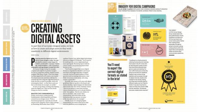
Editorial design can be a daunting task for someone who isn’t used to formatting large amounts of text. The skills you’ll need are different to those of other types of graphic design – organization and planning are key. However, if you’re keen to add another skill to your design portfolio, editorial design could be a great place to start.
In this article, I’ll share some editorial design tips to make sure your life doesn’t suck while designing editorial layouts in InDesign CC. If you want to take things further, check out our guide to brochure design and our article that teaches you how to design a book cover.
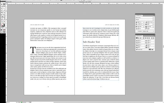
01. Get organized first
InDesign is set up specifically for editorial design
First things first: you need to have all the content organized and finalized before starting to work on the design of your book. Working with content that is still developing will only lead to an inconsistent product and plenty of headaches along the way.
Keep chapters separate and use InDesign’s book feature to link them all together. Never, ever, try to work with one long InDesign document for multiple chapters in a book. It will make your life a living hell.
02. Set up master pages
Set up your Master pages before doing anything else. Your Master pages will include any design elements that will carry through the whole layout, such as folios and automatic page numbering.
Use separate Master pages for different editorial layouts within your document. For example, if you have a sidebar column, set up a master for that type of layout. If you have a layout for the beginning of a chapter, set up a master for that. If you have an Appendix with no formatting, set up a blank master for that… you can see what I’m getting at.
You can use as many Master layouts as you need. This will be a huge time saver in the end.
03. Establish a visual hierarchy
Make sure you establish a visual hierarchy, and stick with it. No matter the editorial content, a hierarchy is key. As well as being more aesthetically pleasing, a hierarchy will enable readers to skim the page and find the content they’re looking for. A basic outline for text hierarchy might look something like this: Main headline, subhead 1, subhead 2, pull quotes; body content, captions, folios.
It is very important to make sure the design of each level of the hierarchy is consistent throughout the document, which is where Styles come in. Styles are your best friend; use as many Paragraph and Character Styles as you can. The more efficient you are with these, the easier it is to make sure everything is consistent.
04. Create a balanced layout
Use images to offset text so headlines don’t line up
Think about the balance of imagery and text in your layout. It can be a good idea to use images to break bigger chunks of text into digestible blocks to make them easier to read and absorb. Visuals will also make the page more interesting to look at.
Ideally, you want to make sure headlines don’t crash into each other. For example, in a 2-column layout, you would not want to have both columns starting on the same line (above left). Add images to offset the columns (above right), or use the Span Columns function to create a headline that runs across both columns of text.
05. Don’t forget about screens
It’s not unusual for print articles to be made available to view as PDFs online, so you may need to consider this in your design too. If designing an editorial piece for print, make sure it will be readable when viewed on a screen.
PDFs will often have live hyperlinks, so check these all work. Also consider using links within your table of contents, so readers can quickly jump to the chapter or section they want.
06. Choose fonts carefully
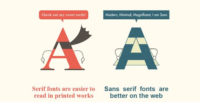
This infographic compares serif and sans-serif fonts
Your decision on which typefaces to use should be based on where most readers will be viewing the editorial. Many people argue that serif fonts are best for large blocks of text in print, while sans-serif fonts work better for large blocks of text on screen.
It takes a village to build a store – either a virtual or physical one. Getting a commercial lease, recruiting a team of staff members, stocking up inventory and setting up long-term partnerships with warehouses are among the most concerned factors when setting up a physical store. Building a virtual store that is based on an e-commerce platform does not require any less effort than that is put in a brick-and-mortar establishment.
The swift-rising growth of e-commerce along with the increasing habit of online shopping among internet users over the past two years has added weight to the demand for setting up an e-commerce store as fast as possible. Articles such as “how to set up an online store in 15 minutes”, “how to automate the process of establishing your virtual store’s foundation”, “how to create your own handmade clothing store with Shopify free of hassle” has flooded the self-help section of google search.
Fast food, fast fashion, then fast business launching.
Now that a large quantity of online stores has risen to the surface, it is the quality of the virtual store that a business owner should take into serious account. Besides choosing the market segment, searching for the right suppliers and setting up a specific tone for the business personality, creating the appearance of your business also plays an important role in winning loyal customers.
Choosing the right e-commerce platform for your business is like deciding whether a full basement, a slab-on-grade or a crawlspace suits the architectural structure of your house. Does an optimal e-commerce platform for all kinds of businesses exist? Designveloper suggests five types of commerce platform as following:
Traditional platform
Kentico
Oracle platform
Traditional e-commerce platforms require you to invest intensively in your virtual website, from paying an annual subscription fee or license registration fee, for your website as a way of maintaining the online presence of your business. Since traditional platforms do not offer pre-existing features like open-source platforms, which we will discuss further in a minute, you as a business owner might need full-time assistance and operation from your teams of IT in order to customise and develop your website in a timely manner in accordance with the buyers’ shopping habits and the latest trends in website designing and development. Regarding what type of platform is the most suitable for your business, people at Designveloper are more than willing to provide you with professional advice.
Traditional e-commerce platforms could be slightly more cost-effective than traditional brick-and-mortar platforms thanks to the significant cost reduction in estate rent charges infrastructure costs and human resources, yet traditional costs like costs of input (products), warehousing (unless your business is trying out the drop-shipping business model), logistics and business taxes are pretty much still intact when it comes to business expenditure.
Open-source platform
Magento
If you as a new business owner prioritizes cost-efficiency, a large number of design options and more efficient control in hosting the website, plugins and website themes, an open-source commerce platform would be a perfect option for you. The majority of open-source platforms are always membership-charge free and constantly under development as developers of such platforms would update the current trends in e-commerce on a regular basis for free.
Business owners will never have to worry about falling behind the e-commerce trends in designing as innovative features are constantly added to the shopping experience of the customers, which in turn will increase engagement with online shoppers and further raise the likelihood of customers’ revisiting your virtual store. Such innovations being constantly updated on the open-source platforms are made thanks to the generous contribution of the community of developers.
However, there are always two sides of the same coin. An open-source e-commerce platform allows you to save time researching heavy subjects in programming and refreshing the appearance of your websites when you feel the need of giving your business a reboot. Yet the same platform could cost you more time in researching feature problems as there is little consistency in the foundation of the platform. You soon will find yourself in need of more intricate knowledge in website development. For instance, the final step including check-out and payment encounters technical glitches that fail your customers’ wish to buy a certain product and therefore, causing them to lose interest in making purchasing goods from your inventory. Such error cannot be mended quickly if you lack an advanced understanding of your own store foundation and have no professional developers as a part of your business staff. When such errors occur, you can contact Designveloper for the fastest development solutions and saves you time manhandling the problem by yourself.
Our designers suggest Magento if you are seeking an open-source platform for your virtual business. Prominent businesses that achieved significant success thanks to the operation based on open-source platforms are namely Amazon, IBM – International Business Machines Corporation (a New York-based multinational group, Ticketmaster – a California-based company specialised in ticket sales and distribution, and Wired (a monthly American magazine specialised in emerging technologies and how they affect culture, economy and politics).
Cloud platform
Demandware
Salesforce Commerce Cloud
Let’s go through the advantages of cloud-based platforms: low-cost entry, flexibility, constant updating, low support cost, real-time data tracking and so on. Cost efficiency is the most concerned factor any business owners would have to thoroughly consider at any stage of their business operation, from early set-up, store launching to maintenance. Thanks to the low entry cost of cloud platforms, an independent business owner can set up their own virtual store with a minimum cost of platform subscription and a limited number of SKUs that typically generate a satisfactory proportion of additional sales per month.
A cloud-based platform would allow business owners to be flexible in micromanaging the number of active vendors at any time – you can fish out or add up the number of vendors whether you wish to better control a certain number of vendor participants in your business or to scale up and increase the engagement of vendors to your business. Consequently, this will allow a solo entrepreneur to multiply the number of products and offer more to their targeted marketplace.
Constant travel to meet new potential clients and investors means business owners will have to manage their business operations remotely. This is when the real-time data tracking comes in handy for subscribers of cloud-based platforms. Instant access to your database of clients, vendors and transactions anywhere you and your team members wish to gain is a major game-changer for business owners who are always on the move.
The most efficient cloud-based platforms that Designveloper have chosen for our own customers are Demandware, Salesforce Commerce and Volusion. Marketing companies, data security groups, multinational companies (or global companies) and accounting companies are among businesses that benefit the most from using cloud-based platforms.
SaaS Platform
Another e-commerce platform that makes the list of plausible platform options for an owner of a virtual business is SaaS or service-as-a-service platform, one of the three primary fractions of cloud computing, along with IaaS (infrastructure as a service) and PaaS (platform as a service).
Similar to cloud platforms, SaaS platforms save virtual store owners from the hassle of installing and operating software applications on their personal computers and any computers. Thanks to SaaS platforms, the entire database of your business is uploaded and available on the internet. Given a steady internet connection, you and your staff members can gain access to your business software at any time, making sure you never run into the unfortunate scenario of data loss.
With a specific monthly subscription charge, SaaS platforms are frequently recommended by professional designers and website developers to businesses of various scales – small, medium and large. Businesses that hold a tight policy of non-disclosing customers’ data would also opt for SaaS platforms due to their outstanding features of security and system maintenance. Reassurance gained from a safe and secure system established on a SaaS platform would enhance trust between customers and service providers, creating trustworthy partnerships as a result.
Large enterprises such as Netflix, American Red Cross and Google G Suite are well-known for their upscale services thanks to the tight security feature offered by SaaS platforms.
Build your own
If none of the above commerce platforms catches your eye, you can also build your own customized store. However, since you are obliged to start from scratch if you decide to go all the way with the decision, there are costs that you have to bear in mind like website development, maintenance and new feature updating. It is highly recommended that you contract either internal or external human resources to develop a virtual website using such type of e-commerce platform. People at Designveloper are willing to help you with the DIY platform since it is our mission to carry out the best design-and-develop services to our customers.
Throughout our development projects since the beginning, there are common patterns in website building that we would like you as an entrepreneur of a virtual store to keep in mind when selecting an appropriate e-commerce platform:
Choosing a platform that’s hard to keep track of;
Redundant features;
Having no clear objectives beforehand;
Customizing the wrong way.
Contact Designveloper for professional advice when you have questions regarding the website development of your business.
Ranging from Facebook’s iconic sky blue F to the golden M of McDonald’s, logos that perfectly represent brand personality can instantaneously lock the audience’s memory in. How did well-recognized brands come up with such timeless icons? Who was behind them? What factors in the perfect logo? Where to find a great team of designers? Or how to create a logo on a budget? Designveloper offers you two cents on this question.
Simplicity
(Nike – Apple – McDonalds – Audi – Playboy)
If you are an independent business owner who is profiting from emerging e-commerce, you might want to opt for something simple. Try thinking about your first date. How you come up with a sketch of your business logo is the same way you dress to impress on your first date. Believe you and me, you would not want to be seen as putting on display, would you? Know your target audience, and dress properly. Something in your closet that you come across on a daily basis, something that screams out your personality, something that energizes you on the dullest day… Designing a brand logo is the same way you put together an outfit for a date night, or a date lunch if you are into daylight rendezvouses.
It takes 50 milliseconds for the digital audience to form an opinion about your logo which determines whether they decide to like it or not. Same as the dating game. It takes less than five seconds for someone to categorize you into a fraction. Reserved, geeky, liberal hippie, pure businessman, … the first impression truly counts. Simplicity speaks class, therefore, timeless. Standing by scads of existing logos, you need to stay true to your color- your business color aka your business service to your dear clients while standing out of the crowd.
A logo could be a letter, a text, an image, a lingo or a symbol. There is much power implied in a simple logo. It says “Cut to the chase and get down to business” with your client, which is what most of your clients would want to profess while searching for the right designers. The simplicity of your logo needs to be demonstrated on different digital platforms. If your clients’ kid can doodle your logo, you are up by half the game.
Catchy
Visa – Shell – Disney – CocaCola – IBM
The element of catchiness not only lies in the brand advertising tunes as you might think but also lies in the spectrum of colors that are used in the creation of your logo. This means your logo cannot be hard to identify and perceive at first sight. It must be easy to recognize from afar. Imagine the internet users are fast-scrolling copious designs and your logo is one of the top 10 that pop out and can be known by sight. You are halfway there till one of the potential customers can call your logo to mind while they search for a service provider. Your logo simply has to catch attention, otherwise it would easily blend in the other thousands of designs.
Catchiness does not mean you have to the come-and-go clichés in designing. There is no certain formula in designing a logo. However, a single letter with a vibrant color might stand out, but it might lack personality. Remember your outfit on your first date? Choices of tops and footwear that are color-matching are impressive, but your outfit accessories might help you stand out of the crowd of ombre-looking outfits. A letter, or plural letters, with signature color and an unusual format or font can playfully stir the viewer’s mind.
As you know by now, that’s 50 milliseconds or 0.05 seconds you, as a logo designer, should not underestimate. The first impression in a great visual logo design makes or breaks – either resonates well with the audience or blends in the rest of millions of logo designs. Like a catchy tune that gets stuck in your head even when you resent it, you cannot help but humming to that tune while taking a shower, a catchy logo must stick to the mind longer than a second, especially with the fast reducing attention span of the internet users nowadays – 45 seconds.
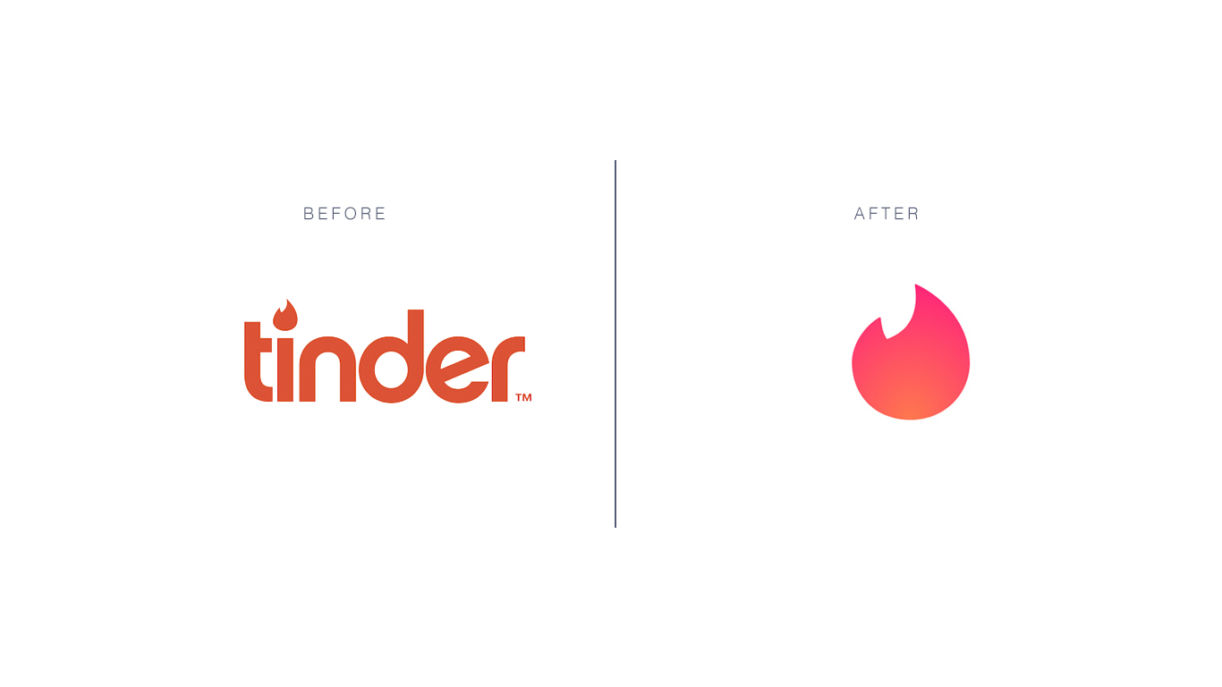
Relatable
Tinder
Freedom – inspiration idea for an innovative company
If a logo enables a person to feel that they can relate to someone or something familiar and even themselves, you are halfway down the road of creating a kick-ass logo. The experience of emotions can be powerful as our memories are attached to it. A palm tree that speaks nature and chill time for a resort, a unique rough sketch of an elephant for a note-taking application that puzzles the users really hard – why an elephant”; an image of a furniture piece in grayscale resonates with the segment of customers that are scouting for vintage interiors… Anything that generates familiarity in the back of the customers’ mind will work since this type of memory would be triggered again anytime when the customers are in the environment that reminds them of the image – the concept of your logo.
The work of a logo designer lies outside of customizing a product as per the clients’ request. A designer must also be a magician who evokes emotions into customers’ mind, making them recall your service – your work – for as many times as possible.
Graphic
UPS – United Parcel Service, logistics company, NBC – National Broadcasting Company
A large audience of the internet are visual. Visual content like videos and gifs are on the upward trend in Southeast Asia since 2016. The ever-shrinking span of attention among internet users, from 4 minutes 45 seconds in 2012 to 45 seconds in 2018 puts up quite a challenge to content creators and designers. Something graphic, vivid and lively is more likely to rouse the audience’ emotions, which in turn creates a more lasting impression on your logo and induces engagement. Before opting for a graphic for your brand logo, make sure you have checked the appropriateness of the graphic toward to majority of the internet users.
Ask yourself who are you in your clients’ business venture – a consultant, a fellow, someone who brings changes, someone who is willing to shed some truth to your clients’ unrealistic ideas. If you are designing a logo for your own company, ask yourself these three questions – who are you to your clients, what values do you bring to the game and what can best represent your brand personality. The lush green of palm trees may suggest business in hospitality or a beauty and spa service but probably not a great logo idea for an engineering consultant company.
If you have trouble sorting through the right graphic options for your business logos, contact professional designers in Designveloper (insert a hyperlink here). We are more than willing to help you with thousands of available graphics options that best match with your brand personality.
Resizable
GE – General Electric, HP – Hewlett-Packard, Walmart
Your business logo will be shown and printed on various mediums – company website, T-shirts for outdoor teambuilding activities, your staff’s electronic signature, desk calendars, neon signs, advertisement billboards, promotional items like pens and pencils, etc… Whatever details and design twists you bring into your logo design, regardless of its complexity, make sure it can be seen on a miniature scale. Should you wish to have your logo appear on larger surfaces like billboards, make sure the proportion of the design is equivalent to the original one – this means the tail of the huge sky blue Facebook icon of the letter F cannot be too long or the stroke too wide.
The versatility of your logo design should be well-represented on promotional products. The Swoosh symbol of Nike can be seen in plenty of colors besides white – on socks, sneakers, trainer T-shirts, trainer shorts, caps, backpacks and even bootleg products such as wallets, scarves, and sunglasses. It’s best to consult with a professional marketer or a designer before you put forth a logo design on your products. With … years of experience in customizing logo design, Designveloper can turn the most abstract idea of yours into reality.
When everyone gives serious attention to their health, the digital medical care industry is growing bigger and bigger every year. In 2018, it was estimated to be valued at US$28.320 billion. The cake is still there to take home, so are you ready to start a million-worth hi-tech healthcare system? Here are the 5 things Designveloperbelieve that you should acknowledge before developing this type of product.
1. Do not rely on only developers, experts from the healthcare industry are really important
Even if your team is a skilled one, it does not mean that they have a precise and accurate understanding of the medical industry.
In 2012, researchers from the American Medical Association’s JAMA Dermatology conducted a test on several malignancies analyzing apps and the results were 30% of the cases are wrongly diagnosed. As stated in research by the New England Center for Investigative Reporting, there is a notice-worthy number (80% of 1500 healthcare app investigated) of existing apps that have not been clinically tested. As a consequence, faulty information and diagnoses from those mobile apps will affect users’ decisions towards their health condition, and worse, it may result in a real legal problem.
That’s why you need one or more healthcare experts to give advice on the product’s features, medical-related knowledge, etc.
However, don’t underestimate the importance of development teams. In general, the medical industry is the one which requires accuracy and quality products to serve people. For that reason, a mobile healthcare app (or you could call it “mHealth app”) has to be precise in both medical and technical base. After all, your product is all about human healthcare, please don’t take any risk regarding to this.
2. Define your Target Customers
Everybody knows that this is an important preparation before starting to design and develop an app. Let’s say, we will have to do some research about the market, including potential competitors, customers and market share as well as current trends of the industry. Obviously, all of these are operated for successfully promoting the app. Those theories sound simple, yet, when you put a step in this industry, healthcare might be a tricky one to deal with.
“Those theories sound simple, yet, when you put a step in this industry, healthcare might be a tricky one to deal with.” Image: HR Cloud.
First of all, the term “customer” is a bit vague to use in this situation. Because in the healthcare industry, you will have three types of customers:
Patient: Most of the consumers in this segment lack proper knowledge of healthcare. Therefore, product designers and developers have to simplify the implementation of the product. Moreover, according to a study by IMS Institute, a leading mHealth app should include one or more functionalities like inform (provide information in a variety of formats), provide instruction, record user data, display (graphically display/output user entered data), guide (provide guidance based on user-entered information, and may further offer a diagnosis, or recommend a consultation with a physician or a treatment), remind/alert, communicate between healthcare providers and patients.
Provider: This type of customer includes doctors, nurses, physicians, etc or any other party that has a deeper knowledge of the industry and plays the role of assisting the patients. Just like the first segment, their highest priority when choosing an mHealth app is the ability to improve healthcare outcomes. However, these providers are able to monitor and access more complicated platforms carrying lots of medical terms or information. While the amount of app for patients is huge, it is worth to notice that the number of apps for a healthcare provider is still low (2% according to IMS), and obviously, this is a potential market to app publishers.
Organization: Due to the urgent need to integrate technology so that their working process becomes more effective and accurate, big and small hospitals, clinics, pharmacies, etc. are also in the rush of looking for an mHealth system to implement. As stated in a study by the Healthcare Information and Management Systems Society, there are “58% of hospitals have mobile-optimized patient portals, and 47% of hospitals are looking to expand connected health technologies”.
After successfully having defied your key customers, the mission now is to customize their journeys when using your app. It would be the design (simple for customers, more sophisticated for providers or more interactive for organizations, etc.), the content (general terms for customers, clinical/medical ones for organizations and providers) and also the core features.
One more thing you should focus on is the ability to catch up with the requirements of your clients and the need of the market. Thanks to Scrum and its specialties, a software development company like Designveloper is able to solve the problem and enhance its projects frequently.
3. Focus on a significant feature (or more)
Like any other category, the amount of healthcare app is growing up day by day. Right at this moment, there are over 80.000 (4.84%) healthcare apps (in both health/fitness and medical category) listed on the App Store. At Google Play Store, the number is about 88.400 (4,21%). And according to Liquid State, about 200 healthcare and healthcare-related apps are added every day to these two platforms.
“About 200 healthcare and healthcare-related apps are added every day to App Store and Google Play Store.” Image: A Market Report Journal.
In the light of all those numbers above, you now may have a better understanding of how the mHealth market is doing and how intense the competition is right now. That’s why we are recommending that your app has to be special and user-driven.
To be more specific, on the one hand, your team has to design and develop an app with insightful features, the ones that your key users will commit to open frequently thanks to the benefits and convenience they bring.
On the other hand, those features must be either one of a kind or an enhanced version of numerous existing ones. For example, one of the highest ranked heart care apps at the moment is TreatHF: it dedicates for patients with heart failure. The app does not conclude too many functions but only provides custom-made recommendations on patients’ dosages, addition drugs or research-based treatments. The unique feature together with user-focused attitude is two things that make TreatHF the game changer.
TreatHF app. Image: iMedical App.
4. Know and understand industry’s restriction, data security & other regulations
mHealth is widely recognized as a handy application category because of its various benefits for patients as well as healthcare industry workers. However, there is also a huge risk of data breaches that law-makers need to take care of. That’s why before launching an mHealth app, nothing is more important to pay attention than checking related regulatory requirements and best practice principles.
Your app may be introduced in only some regions or all over the world. Either way, it must follow local regulations and the activity of researching for all of them will be a big challenge. In this article, we will show you the example of “Code of Conduct on privacy for mHealth apps” conducted by the European Commission. Hereby are some of the most important issues listed in the Code:
User’s consent
Purpose limitation, data minimization and secondary purposes
Privacy by design and by default
User information
Data retentionSecurity measures
Advertising
Data transfers to third parties
Personal data breach
Data relating to children
Besides the Code of Conduct in Europe, the U.S. also has its own version of data protection regulations like HIPAA and HITECH. In short, app developers and publishers need to take things seriously when it comes to these kinds of data:
Patients’ general information (contact data, social security number, demographics and income details)
Medical history
Insurance-related data
Appointments, office visits, and follow-ups
Prescription
If you are not so confident or have no time to research all those regulations and restrictions, it’s time to reach out for a consultant firm so that your app will be operated legally. Another option for you is to look for a skillful software development agency like Designveloperto solve all of your problems from building the system, designing and developing products to mastering data security and encryption.
5. Consider if you want to create a whole ecosystem for your business
If you are doing some research about healthcare technologies, then this trend is one thing that you cannot miss.
Thanks to the development of APIs, healthcare ecosystem apps are on the rise too. In 2018, as a good signal, Apple launched its own Health Records API to developers and medical researchers. The API encourages mHealth development companies starting an app system to better manage medications, nutrition plans, diagnosed diseases, etc.
“In 2018, as a good signal, Apple launched its own Health Records API to assist developers and medical researchers on enhancing the system.” Image: Apple.
Epic’s App Orchard, Cerner Open Developer Experience, Athena’s Developer Portal, or the Redox network are some of the uprising healthcare ecosystems across the U.S. These systems allow patients and providers access medical information from various resources. The idea is to create better clinical diagnoses and to improve patients’ overall health condition.
What else can a healthcare ecosystem do?
Medical tracking. This is one of the most common functions of an mHealth app. However, with a healthcare app ecosystem. Prescriptions can be imported from app to app so that healthcare provides can make a better decision on what pills patients should take and provide other medical advice.
Disease Management. Various integrated products are able to access patients’ health records, their diet and exercise routine via mobile and wearable products (smart watches). As a result, it’s easy to mHealth products to create their own time table to remind patients/users to take their pills, do exercises, etc. Healthcare providers would also have a better picture of their customer’s condition by using the data on this system.
A better resource for testing. The information and hub are larger than ever, software development teams will have more chances to access various cases and scenarios to test on its product and system.
Implementation improved. It’s good news for software development companies. As stated above, the data resource from an ecosystem is huge and the development team could use this on their testing stage to improve user’s experience and software personalization in all levels (patient, provider, organization). Implementing this new trend will give companies a competitive advantage in the market.
Reduce cost. A simple but effective ecosystem will help organizations reduce time to record patients’ data, effortlessly deliver information from departments to departments. With less operation, the organization will also need fewer staff, and a huge amount of cost is cut as a result. Furthermore, their patients and providers don’t have to wait for a long time to get the services that they want.
So tell us, do you have any other advice on this topic? Just contact and show us your idea. And if you are looking for a mHealth product development team, why don’t you look at our portfolio and decide whether Designveloper is for you. Cheer!


