Originally designed in 1974 and launched internationally in 1980, Rubik’s Cube is a design classic that’s sold by the hundreds of millions. Over the years, it has delighted – not to mention infuriated – countless people around the globe.
The original cube was an extremely clever piece of design and engineering that defied improvement; it’s been refined so that speed-cubers can turn it even more times without the cube falling apart, but basically this is one of those situations where the design thinking was absolutely bang on the first time. Pick up any Rubik’s Cube, or indeed any imitation cube, and you know exactly what to do with it – even if you don’t know how to solve it. Who needs a high-tech update when the original just works?
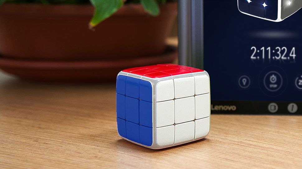
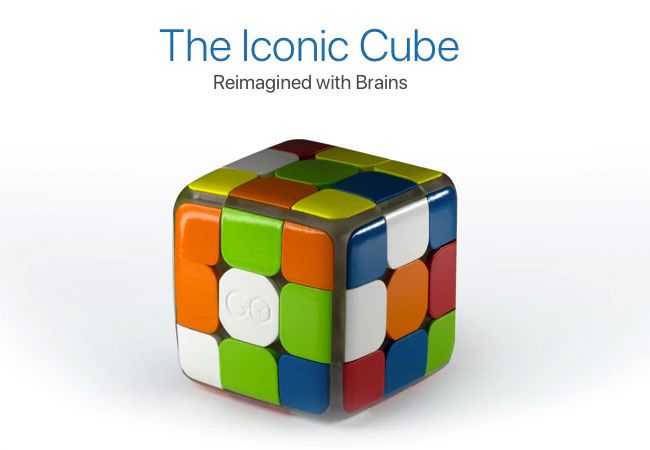
The GoCube – like the Rubik’s Cube, only smarter
Well, it turns out that lots of people do. Designed in Israel by Tel Aviv company Particula, the GoCube is pitched as the Rubik’s Cube reimagined with brains. It still behaves the same as a standard Cube, but now has loads of clever high-tech features designed to help you learn how to solve it, improve your times and even race against friends online.
The GoCube tracks its movements using built-in sensors, and connects via Bluetooth to an app that displays your cube on your phone or tablet, and also features various games and challenges to improve your cube handling and instincts.
The GoCube app will help you solve the cube then improve your times
It’s set to retail from an eye-watering $119 for the basic GoCube, but if you want to get your hands on one at a substantial discount, you’d better hurry over to the GoCube Kickstarter, where you can save around 40 per cent on various GoCube packages. The GoCube might sound expensive but that’s not holding anyone back; it’s torn right through its original Kickstarter goal of $25,000 and has clocked up over $800,000 of pledges. There’s now less than 24 hours left to run on the campaign.
There are many ways to use your design and illustration skills to generate extra income, over and above picking up freelance work. For many creatives, profit isn’t top of the agenda when planning a side project. It’s a bonus, rather than the main goal. However, even if side projects don’t bring in extra income immediately, the boost to your graphic design portfolio can lead to work indirectly – or make money in unexpected ways further down the line. Here, we explore four ways designers have branched out and turned a sideline project into a big earner.
Diana Hlevnjak sells patterns and textures via Shutterstock and iStock, as well as her own site
Diana Hlevnjak was working for a small web design firm when personal circumstances led her to relocate to another city. She managed to work remotely for a while, but times were tough and her contract was terminated shortly before the company shut down.
Hlevnjak had been selling digital assets through stock libraries for some additional income, but there wasn’t enough to cover her costs. She focused all her efforts on the task to see how lucrative it could be. “I liked the fact I didn’t have to deal with sales, clients, meetings and similar tasks that introverts don’t like,” she confesses. “It also meant I could work from anywhere.”
When she first started out, the returns were low, but gained momentum as she kept putting up more and more products on more and more platforms. Hlevnjak’s focus was on graphic resources such as patterns and textures, an area she’s passionate about. This is crucial, she argues, to stay motivated when building up a large portfolio of assets.
I liked the fact I didn’t have to deal with sales, clients, meetings and similar tasks that introverts don’t likeDiana Hlevnjak
She watches trends across illustration and design, as well as fashion, interiors and architecture. “Last summer was big on monstera and cacti plants, which came from Scandinavian interior design,” she says. Although her work is still sold on Shutterstock and iStock, Hlevnjak points out that the volume of assets on the large libraries means things that are on-trend one month are soon buried beneath new trends.
She has instead been focusing her efforts on more niche marketplaces such as Creative Market, where watercolour illustrations and textures tend to fare well, as well as her own website: Polar Vectors. The strategy has paid off: Hlevnjak has successfully managed to turn an occasional sideline into her primary earner. “As a freelancer, I am accepting less and less client work, and it’s become a minority of my revenue,” she reveals.
02. Teach a Skillshare course
Online courses are a practical option if you have a busy schedule
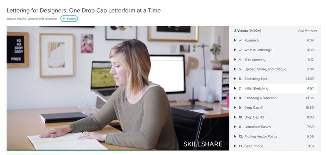
Following her success on the conference circuit and growing love of public speaking, Jessica Hische decided to turn her hand to teaching – and her hectic schedule meant an online course was the best option.
“I haven’t been in a position to commit to teaching at a university – I’m hardly ever in one place for 15 weeks straight,” she explains. “Skillshare was a good in-between of an on-stage talk and a more intimate classroom. You can pour more into an online course than you can a one-hour talk, but it does scale, unlike in-person teaching.”
You can pour more into an online course than you can a one-hour talk, but it does scale, unlike in-person teaching
Hische’s first course was based on her Penguin Drop Caps book project, which was itself inspired by one of her best-known side projects: Daily Drop Cap. Although Hische was responsible for putting together the course content, Skillshare took care of all the “production heavy lifting”, including filming and editing. Her second course took a more general angle, focusing on the logo development, feedback and the revision process.
“It’s been a very good source of income over the years, especially when it first launched and they had a different model for paying teachers,” she reveals. “Initially they sold tickets to each course and teachers made 75–85 per cent of the ticket cost, but a couple of years in they switched to a membership model that does revenue sharing based on class popularity,” Hische continues.
“But not every teacher earns a lot from online teaching platforms,” she warns. “You do really need an audience that’s already interested in your work to take that leap to starting a class.”
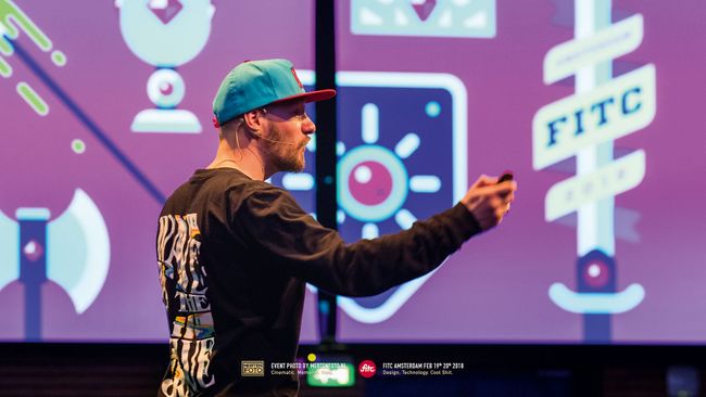
03. Speak at events
Even if they don’t pay, speaking opportunities can open plenty of doors
A common thread evident with many of the creatives featured here is public speaking – not just as an income stream in and of itself, but also as a springboard to other opportunities. Jessica Hische, Jon Burgerman and Gavin Strange have all clocked up their fair share of design talks around the world.
“I was first asked to speak about my work because of Daily Drop Cap,” recalls Hische, revealing yet another major opportunity spun off from that one killer side project. “After gaining a bit of experience, the demand snowballed. I was very nervous at first, but with a little practice it has come more naturally to me. I became a good speaker, and conferences are always on the hunt for strong female voices in their lineup,” she points out.
“I try not to do speaking jobs unless I’m paid, or it’s for a good cause,” reveals Burgerman. “It’s work, so I need to be paid! Otherwise there are books and movies I’d rather be catching up on.”
Conferences are always on the hunt for strong female voices in their lineupJessica Hische
While talks at schools, colleges and non-profits are rarely paid, full-blown conferences tend to offer a fee, plus travel and accommodation. “Fees range between $1,500–10,000, with almost all events that I enjoy talking at falling on the lower end of that range,” explains Hische. “The more you’re paid, the more likely it’ll be a very business-like conference, rather than a looser creative event.”
She has several ways of figuring out the right speaking fee, including taking into account how much prep time is involved and how long she’ll need to be out of the office.
Like Hische, Strange insists on transport and accommodation to be paid as a minimum, and always asks for a speaker’s fee for more commercial-focused talks for businesses. “Depending on the size of the festival, some pay and some don’t,” adds Strange. “Over the years I’ve become comfortable having that conversation. They’re nice bonuses to have, but I didn’t get into speaking for money,” he concludes. “It’s the joy and excitement of having the privilege to do so.”
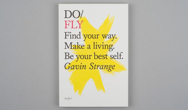
04. Write a book
Gavin Strange turned reams of talk notes into a book
After almost eight years of writing talks – a totally new one each year – Gavin Strange ended up with a vast bank of written notes. After speaking at The Do Lectures he was handed a book by David Hyatt, co-founder of Do. “I loved it because it was so inspiring, but it was also formatted a lot like how I structure my talks,” he recalls. “For the first time ever I thought, maybe I can write a book?”
He got in touch, and the rest was history. Working closely with Miranda West, editor and founder of the Do Book Company, his book – Do Fly – took shape. Although profit is never high on the agenda for Strange’s side projects, Do Fly provides him with some royalties every quarter, and has recently been licensed to indie publisher Chronicle Books to distribute in the United States. Appetite duly whetted, Strange is already thinking about his next book – and how it could be timed to coincide with turning 40 in a few years’ time.
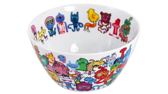
05. Design products
Jon Burgerman has transferred his designs onto a range of items
Over the years, Nottingham-born, NYC-based doodle master Jon Burgerman has dabbled in a dizzying array of self-branded merchandise, from toys, prints, books and T-shirts to mugs, laptop sleeves and wallpaper.
Of course, he had to start somewhere and learnt a few lessons the hard way: “Always make things in small batches first, and see how your market reacts,” speaks the wisdom of experience. “Don’t make a thousand T-shirts. Make 10. I think there’s a basement in Nottingham that still has a few boxes of my unsold T-shirts in it,” he winces.
“Hand-make stuff to keep the manufacturing costs down for low runs,” he continues. “There are lots of print on-demand sites, so make some test pieces, show them to people, and see if anyone will buy them. Go from there. Dead stock can be costly!” Advertisement
Don’t make a thousand T-shirts. Make 10… Dead stock can be costly!Jon Burgerman
Burgerman also advises thinking about distribution from the outset, however small-scale your operation. “It’s super-easy to make stuff, but how are you going to sell it? Where will people buy it? And how are you going to ship the stuff out?” he reels off.
“It’s not fun spending all day and night packing up little toys into custom-made boxes, then waiting in a huge Post Office queue to send them out,” he adds. “Then there’s things like dealing with missing packages, and grumpy customers who want everything delivered the minute they place their order.
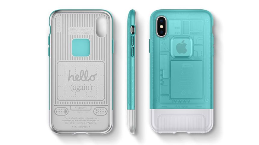
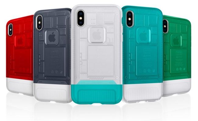
It’s been 20 years since Apple launched the first in its series of game-changing personal computers. Instantly recognisable thanks to its unique shape and brightly coloured, translucent monitors, the iMac G3 provided Apple with a much-needed shot in the arm.
To celebrate the anniversary, phone accessory manufacturer Spigen is bringing the design of the iMac G3 to the iPhone X with a series of fun cases.
Unveiled through a suitably charismatic presentation by Steve Jobs on May 8 1998, the iMac G3 would go on to set itself apart from the pack with a range of colour options including Bondi Blue, Blue Dalmatian and Flower Power.
Sir Jonathan Ive, the man behind the look of the iPod, is credited with creating the groundbreaking industrial design. Jobs summed it up best when he said “it looks like it’s from another planet. A good planet. A planet with better designers.”
Spigen has proved that there’s still a strong market for brightly coloured tech packed with turn-of-the-millennium appeal as its iPhone X Indiegogo campaign has already smashed its target.
The manufacturer’s Classic C1 phone cases are described as ‘familiar but extraordinary’. Tapping into the nostalgia of people who grew up with the original iMac G3, these clever cases shrink down the desktop’s design elements into something that you can carry around in your pocket.
“We took the chance to deepen what we already knew of the iconic computer,” says Spigen on its fundraiser page. “We personally bought, cleaned up and re-examined every part of the classic computer to bring it back for devices of today.”
The phone cases match the original colours of the first iMacs
With a month to go until Spigen’s Indiegogo pledge comes to an end, there’s still plenty of time to snap up one of these cases for as little as $25. And with this phenomenally popular project having already sailed past its goal by 1139%, you don’t even have to worry that your pledge will go unrewarded.
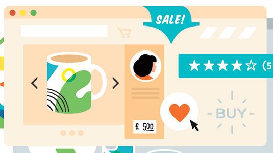
If you’ve been hard at work in your spare time creating stunning paper art or impressive poster designs, selling your merchandise online can be a quick way to make extra pennies for your efforts.
However it’s not as simple as sticking it on the internet and hoping people hand over their money. In fact there’s a fine art to tempting people into buying your wares – especially now the lower barriers to entry mean anyone and everyone can sell their creations online. Luckily this crash course list of advice will get you ready for the fast-paced world of online design retail.
Here we’re focusing on Etsy, but there are other places geared up towards selling designer-maker goods – take a look at our list of great places to sell your design work online for more info. And if you’re looking to start from scratch, it’s worth reading our in-depth guide to how to succeed as a designer-maker for success stories and advice.
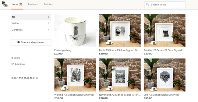
01. Get product photography right
It can be helpful to include something to indicate scale
Images are really important when selling on Etsy – or anywhere else online. It’s the only way your customers are able to see what you’re selling, so make sure your photos are clear, well-lit and appealing. In particular, make sure your backgrounds are plain and neutral – keep the focus on your products. However, it can help to include something for scale in one of your photos. For example, RockCakes shows her jewellery on a person (above), so prospective customers can see how big it is.
02. Use search terms in product titles
Use the Title field to add extra info for your customers
On Etsy, you need to provide each listing with a title. This is a great place to add keywords and search terms that your buyers will use to find your item.
Some sellers mistake this as a place to title a work with a collection or item name – for example, calling a handbag ‘the Julia’ and leaving out important words that help search engines recognise the item, such as style, colour, material and manufacturing method. When writing your title, be sure to include descriptive words that your customers will use.
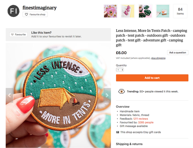
03. Experiment to see what sells
These pins from Finest Imaginary are a summertime purchase
Something successful sellers do is focus on their businesses. They are constantly experimenting and figuring out what works for them. This includes trying out new products, as well as new photos and new ways to describe their items.
They also keep an eye on the results. What worked this year may not work next year, and seasonality and larger trends can play a big part in how well a shop does, so never stop experimenting.
04. Set targets for improvement
Abi Overland offers a small but popular range of products on her Etsy site
It’s good to set small goals over the course of a week. For example, you could start by opening your shop with one item and then add another item each week. It’s also worth signing up for the Etsy Success newsletter, which provides tips from top sellers on the site. Good luck!
Just like any other creative fields, the world of design is always evolving with the passing of time. So even if you consider yourself to be an expert designer, there’s still so much to learn and focus on to stay ahead the competitions and meet your clients’ expectations.
To step up your design game a little bit, I would love to bring to you 7 important rules of user interface design that you better remember:
Get to know your users
This is the most important thing to be considered first. If the designer can’t determine their target audience, they can not create an effective one.
Who are your users – inside and out? What do they need? What will stand in the way of them achieving their goals? Don’t stop at knowing what your users want.
To do that, you are going to need to take some time to speak with your users face to face. Even better, watching them use your product, then asking how they think about it.
Think about how people use your interface
Tapping a button, swiping a card or dragging and dropping an item with a fingertip? What ways do you want your users to do? Let’s think about it first before you design your interface.
Once you defined who your users are and how they interact with your interface, it’s time to build some cool things.
Clarity is job #1
People want convenience, not a challenge. Because of this, please do your users a favor: Make everything as clear and simple as possible to understand. Don’t make them guess.
When people use your interface, they must be able to recognize what it is, understand how to use it and know what will happen when they use it.
Some says that they want to design their interface more mysterious to make people curious. Yes, it’s totally okay, even great, but remember there is no room for confusion.
Design with multiple screen sizes in mind
There’s no one-size-fits-all design for every device in the market. When it comes to designing a website or an app, you need to make sure that you design with all screen sizes in mind. That’s because people nowadays spend a lot of their time on mobile devices from doing business, checking email, shopping or even playing game.
According to a study from Google “What User Want Most From Mobile Sites Today?”, when users visited a mobile-friendly site, 74% of them said that they were more likely to return to that site in the future and 67% of them were more likely to buy on that site’s products or services.
It’s incredible frustrating to try to zoom in and out, up and down, left and right on smaller device to read content. That’s obviously the last thing a customer wants when they are on the move and need to find out about your business.
Therefore, if your design is not accommodating this change, visitors will hit the “Back” button without regret.
Consistency always matters
Consistency makes your interface easier to use, because visitors don’t have to learn new tricks as they move around. When someone or something behaves consistently with our expectations we feel like we have a good relationship with it. The same can be said as a consistent interface. Elements that behave the same should look the same.
Don’t make things so complicated. Keep your creativity for higher order concerns.
If my words do not convince you enough, consider this: According to the Principle of Least Surprise which applies to user interface and software design: “If a necessary feature has a high astonishment factor, it may be necessary to redesign the feature.”
Design for the zero stage
The first time users experience with your interface is the most crucial moment. In order to help your users get to know your interface immediately, it is best to design for the zero state that means the state in which nothing has yet occurred.
This stage should provide users direction and guidance. Once people understand the rules, they will easily find a clear path that leads them to what they are looking for.
Keep users in control
People always want to be the one who decide what happens next when they use a interface. They feel more comfortable when they are in control of everything. If they are instantly bombarded with an unplanned interaction or confusing pathways without their consent, they tend to leave immediately.
Therefore, always keep users in control by describing clearly causation or telling them what to expect at every turn. Even though you think it states the obvious, oh dear at least you did state, you have nothing to lose but a chance to win.
Ready to rock?
Not all of these rules may be useful for your business, but it’s always beneficial to know what’s foundation to rely on in the industry.
As Picasso said: “Learn the rules like a pro so you can break them like an artist.” So why don’t you get your hand dirty, make your own stunning interface by testing and experimenting, and then share it with me in the comment box? Who knows, you might make a new rule by yourself?
When it comes to building applications and websites nowadays, you can’t avoid mentioning icon font. They own tons of amazing benefits like:
easily scalable
lesser http requests compared to images
stylable with CSS (change size, color, etc)
Like normal fonts, icon fonts are available for free or for a fee. If you’re looking for 100% free icon fonts for your website, here is a list of best 7.
Octicons
If you want a simple, lightweight icon font, Octicons will be your best choice. Created by GitHub, it now offers a free set of 163 solid colored icon fonts.This icon pack is currently in version 5.0 and totally free. Download here
Entypo
When it comes to freebies, Entypo will be top of the line. Entypo contains 411 carefully crafted premium pictograms which created by Daniel BruceEspecially, it includes a social extension if you need icons for social networks. Download here
Iconmoon
Available as both a website and an app, IcoMoon offers 490 different vector icons for you to play around with. Each icon pack features detailed licensing so that designers and developers know exactly how icons can be used. Download here
Typicons
You might not know about Typicons yet cause it’s not so popular. However, there is no doubt that it’s one of the better icon web fonts available.It offers a set of 336 rounded vector icons. Download here
Font Awesome
Created by Dave Gandy, Font Awesome is by far one of the safest icon sets you can use. It has been around for years and there’s no reason it will fade away soon.
It offers 585 downloadable free fonts on their website which come in various shapes, including line art and rounded images.
I highly recommend Ionicons for newbies who have known nothing about icon fonts before. Because those icon fonts are pretty easy to setup. And then once you become an expert in how they work, you can move onto almost any other icon webfont out there.
Created by designer Mario del Valle. Captain Icon owns amazing icon pack in which each icon has a very unique design. Which makes them stand out from the crowd is that they’re all hand drawn from scratch.
As you can tell, there’s a ton of free icon font out there for you to choose. This is my favorite list. How about you? Did you have any “I can’t believe you didn’t put it on your top” resources? Feel free to share your secret weapon in the comments below!
Have you ever been in a situation where you knew what you wanted your product to look like, but you had no idea how to communicate with the design agency what you meant in designer-speak? It felt like foreign language, didn’t it?
Pretty much every job has its own language or set of terms that those working in that field use on an everyday level, whether it’s being a doctor, a lawyer or a designer. However, this can be quite a challenge for clients who are not involved in the design industry. So, that’s why we’re here – make thing easier.
In case you want to be more prepared as you meet prospective agencies, I’ve compiled some of the most common UX/UI terminologies to help you make sure you are speaking the same language with designers.
First, let’s make clear what’s different between UX and UI:
UX (User experience) : UX focuses on the human interaction with the computer or device.
UI (User Interface): The user interface is simply how a user interacts with the design on a page.
Okay, it’s time to find out others. Let’s scroll!
A/B testing
At its core, A/B testing is exactly what it sounds like: You take two versions of a product , and present them side by side to a group of users, to determine which one performs better and which one the users likes more.
Breadcrumb
Breadcrumbs are a navigation trail that show users where they have been on your website. Taking a website which has a lot of pages as an example, breadcrumb navigation in this case can greatly enhance the way users find their way around.
Call to Action
It’s a term used for describing specific texts, images, banners or buttons that encourage the reader or viewer of a website to take an expected, predetermined action.
Simple examples include: “Click here” or “Buy now”.
Conversion
This term is used to describe when visitors take whatever action that you want them to make such as: completing a web form, submitting a request for information, subscribing to a newsletter or making an e-commerce purchase.
Flat Design
This is a design philosophy that focuses on clean and minimalist styles. Quite literally, flat means design that has no dimensional depth. Instead of designing elements that look like you can reach out and grab them, flat design goes back to the basics of graphics – bright colors, primitive shapes, icons, etc.
Information Architecture
It refers to the organization of the information, dealing with what pages go where in a website’s structure, what content is contained on each page and how each of these interact with other pages within the site
Landing page
In the purest sense, a landing page is any web page that a visitor can arrive at or “land” on. Oftentimes, a special landing page is designed for a specific business purpose (usually in connection with an advertising or marketing campaign)
Micro-interaction
Let’s have a look at this example:. When you see the red and white box icon on Facebook, you automatically know that you have a new message and immediately click on it to read messages. That’s micro-interactions.
Micro-interactions make devices more human-like in their moments. As a result, the design is more usable and enjoyable.
Prototype
Many people cannot distinguish prototype from wireframe. Look at it this way: Wireframe is just a low detailed presentation of a product, but prototype is a medium or highly detailed representation of the final product.
It’s the sample model of the product that gives the ability to test it and see if the solutions and decisions made about the product are efficient.
Personas
A persona is a profile of your one ideal customer. It is usually a fictional character created based on your user research and interview data.
White space is also called called negative space. It’s the blank space that surrounds text, images or other parts of the page. One more thing adding, white space is not necessarily white but uses the background color of the site.
Wireframe
In short, wireframe is a skeleton of you app or product. As I mentioned above, it’s a low detailed presentation of a design – no images, no content, no interactive elements. It’s like your website blueprint. Designers will take the main group of content that you want and lay it out exactly as it will be on your product.
Conclusion
That’s a look at some of the more common UX/UI terms you’ll see in the design world. Now you’re practically a designer, right? Just kidding! But guess what? You are totally ready for your meetings with a design agency!
By no means is this the be-all-end-all of web design terminology… so feel free to add your own glossary in the comments as well.
Have you ever heard about the saying: “The devil is in the details”?
I bet you did.
When it comes to building a website, this quote still remain true. It can take weeks to finish, cost a fortune, and there are still at least half a dozen considerations that we didn’t fully think through before work gets started. And then, at the end of the day it’s those smallest things that make or break our website.
Even though every designer might have their different plans, there are items that they should (and shouldn’t) be doing during their website design process.
So today I want to go over 6 things you need to keep an eyes on if you don’t want to send your visitors to your competitors’ sites. Be vigilant!
Make proper use of white space
Just because there is white space doesn’t mean you have to cram a bunch of shit in there
Do you like being yelled? No one does! That’s actually a “stuff all you can” website does to visitors! You don’t want to clutter up your website to the point that scares everyone away, do you? Visitors will be very overwhelmed if you cover every inch of your site with haphazard content. So, please leave your site some space to breath!
Also, 2017 is about minimalism and simplicity. It’s a must to incorporating white space into your website for a cleaner look overall and helping visitors to recognize what the most important information you want them to know is.
Bad photos can kill your website
A picture is worth a thousand words. They can help you attract visitors, grab their interest and keep them stay on your website.
Then, imagine if the first thing potential visitors see when they reach your site is unprofessional photos, they’re probably going to click back button without regret. Okay, you might be an expert in your field, but if your photography doesn’t reflect that, no one will stick around long enough to find out.
Don’t spend thousands of dollars on a website design and then ruin it with photos that don’t match your brand, or poor quality photos.
Do not complicate your website’s navigation
Imagine what will happen if you walk for hours in the forest without a compass or a map? It feel daunting, doesn’t it? The same can be said as a website with a confusing navigation.
I do not know about you, but nothing drives me nuts more than accessing a website that I cannot know what to expect clicking a link, or how to easily find what I am looking for.
So please do your visitors a favor. Make your website’s navigation prominent and legible for them to easily understand from the first moment they arrives at your website.
At a glance, visitors should know they are at the right place and how to get to where they want to be. For instance, the main menu should be designed to contrast against everything else so that your visitor’s eyes can be easily drawn to it.
Remember, people want convenience, not a challenge. The easier it is for people to use and navigate throughout your site, the longer they are likely to interact with it.
Your website isn’t mobile-optimized
As I mentioned very bluntly in every blogpost before, it’s a must for any kind of business to have a website that is responsive.
How about you try this (you’d be surprised how many business owners have never done this) – browse your own site on your smartphone or tablet. Then, what do you see? Do you have to do the “pinch and swipe” to get around your website or to read content? If that’s the case, Do you feel frustrated? That’s exactly why your visitors “eww”!
According to Hosting Facts, “A single second delay in your website loading time can result in a 7% loss in conversion, and 40% of web users will abandon a website if it takes longer than 3 seconds to load”.
Nobody likes waiting for so long!
There are tons of other options available out there, why would they waste their time waiting for your page to load? Is your content really worth waiting for? If they really need to visit your website then they might be a little patient, but if they’re just curious or have clicked a link on impulse then they’re more likely to leave right away.
Your website lacks personal interaction
People always want to be heard, seen or listened to. There is no doubt that if you design a website that does not include some elements or moments which user need to interact with, they won’t spend much time per their visit.
Hence, make sure your site seem more like a communication where visitors can interact than a simple portal to find information. It will be an excellent way to engage with your visitors and keep them longer in your website and gather data.
Final Words
After all, if you lack the attention to detail to take care of your own website, perspectives will feel that you are not really serious about your business. How can they purchase for your products or services?
Putting up a shoddy website is the most easiest way to scare your visitors away. Who want to do that with their business? No one!
By addressing these elements above, I hope that you can find out your own issues and improve your website’s performance.
While your website essentially represents your business’s face, why don’t you take time to make it shine! Want help getting your website to sparkle? Talk to our team to see just what we can do for you!
Ranging from Facebook’s iconic sky blue F to the golden M of McDonald’s, logos that perfectly represent brand personality can instantaneously lock the audience’s memory in. How did well-recognized brands come up with such timeless icons? Who was behind them? What factors in the perfect logo? Where to find a great team of designers? Or how to create a logo on a budget? Designveloper offers you two cents on this question.
Simplicity
(Nike – Apple – McDonalds – Audi – Playboy)
If you are an independent business owner who is profiting from emerging e-commerce, you might want to opt for something simple. Try thinking about your first date. How you come up with a sketch of your business logo is the same way you dress to impress on your first date. Believe you and me, you would not want to be seen as putting on display, would you? Know your target audience, and dress properly. Something in your closet that you come across on a daily basis, something that screams out your personality, something that energizes you on the dullest day… Designing a brand logo is the same way you put together an outfit for a date night, or a date lunch if you are into daylight rendezvouses.
It takes 50 milliseconds for the digital audience to form an opinion about your logo which determines whether they decide to like it or not. Same as the dating game. It takes less than five seconds for someone to categorize you into a fraction. Reserved, geeky, liberal hippie, pure businessman, … the first impression truly counts. Simplicity speaks class, therefore, timeless. Standing by scads of existing logos, you need to stay true to your color- your business color aka your business service to your dear clients while standing out of the crowd.
A logo could be a letter, a text, an image, a lingo or a symbol. There is much power implied in a simple logo. It says “Cut to the chase and get down to business” with your client, which is what most of your clients would want to profess while searching for the right designers. The simplicity of your logo needs to be demonstrated on different digital platforms. If your clients’ kid can doodle your logo, you are up by half the game.
Catchy
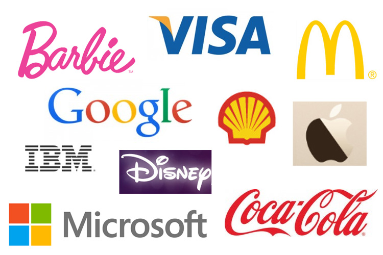
Visa – Shell – Disney – CocaCola – IBM
The element of catchiness not only lies in the brand advertising tunes as you might think but also lies in the spectrum of colors that are used in the creation of your logo. This means your logo cannot be hard to identify and perceive at first sight. It must be easy to recognize from afar. Imagine the internet users are fast-scrolling copious designs and your logo is one of the top 10 that pop out and can be known by sight. You are halfway there till one of the potential customers can call your logo to mind while they search for a service provider. Your logo simply has to catch attention, otherwise it would easily blend in the other thousands of designs.
Catchiness does not mean you have to the come-and-go clichés in designing. There is no certain formula in designing a logo. However, a single letter with a vibrant color might stand out, but it might lack personality. Remember your outfit on your first date? Choices of tops and footwear that are color-matching are impressive, but your outfit accessories might help you stand out of the crowd of ombre-looking outfits. A letter, or plural letters, with signature color and an unusual format or font can playfully stir the viewer’s mind.
As you know by now, that’s 50 milliseconds or 0.05 seconds you, as a logo designer, should not underestimate. The first impression in a great visual logo design makes or breaks – either resonates well with the audience or blends in the rest of millions of logo designs. Like a catchy tune that gets stuck in your head even when you resent it, you cannot help but humming to that tune while taking a shower, a catchy logo must stick to the mind longer than a second, especially with the fast reducing attention span of the internet users nowadays – 45 seconds.
Relatable
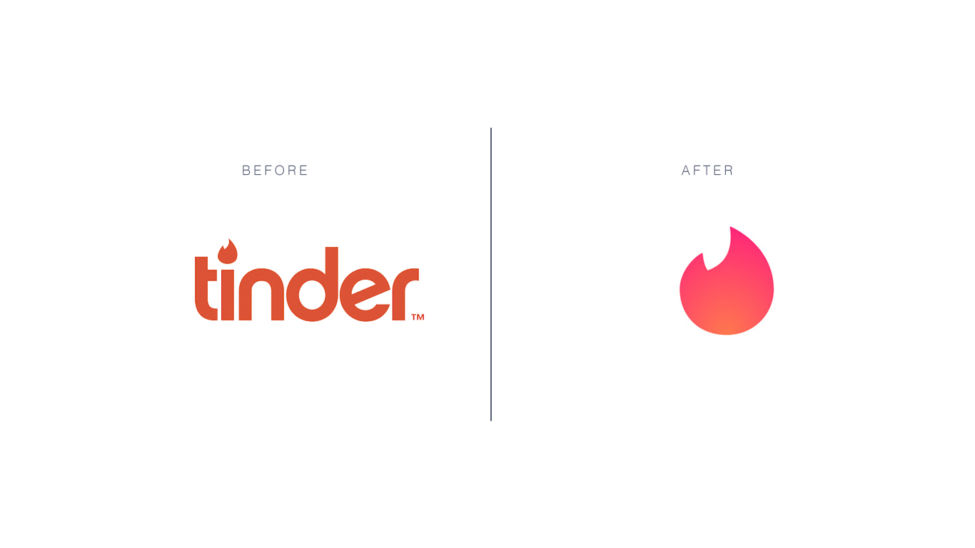
Tinder
Freedom – inspiration idea for an innovative company
If a logo enables a person to feel that they can relate to someone or something familiar and even themselves, you are halfway down the road of creating a kick-ass logo. The experience of emotions can be powerful as our memories are attached to it. A palm tree that speaks nature and chill time for a resort, a unique rough sketch of an elephant for a note-taking application that puzzles the users really hard – why an elephant”; an image of a furniture piece in grayscale resonates with the segment of customers that are scouting for vintage interiors… Anything that generates familiarity in the back of the customers’ mind will work since this type of memory would be triggered again anytime when the customers are in the environment that reminds them of the image – the concept of your logo.
The work of a logo designer lies outside of customizing a product as per the clients’ request. A designer must also be a magician who evokes emotions into customers’ mind, making them recall your service – your work – for as many times as possible.
Graphic
UPS – United Parcel Service, logistics company, NBC – National Broadcasting Company
A large audience of the internet are visual. Visual content like videos and gifs are on the upward trend in Southeast Asia since 2016. The ever-shrinking span of attention among internet users, from 4 minutes 45 seconds in 2012 to 45 seconds in 2018 puts up quite a challenge to content creators and designers. Something graphic, vivid and lively is more likely to rouse the audience’ emotions, which in turn creates a more lasting impression on your logo and induces engagement. Before opting for a graphic for your brand logo, make sure you have checked the appropriateness of the graphic toward to majority of the internet users.
Ask yourself who are you in your clients’ business venture – a consultant, a fellow, someone who brings changes, someone who is willing to shed some truth to your clients’ unrealistic ideas. If you are designing a logo for your own company, ask yourself these three questions – who are you to your clients, what values do you bring to the game and what can best represent your brand personality. The lush green of palm trees may suggest business in hospitality or a beauty and spa service but probably not a great logo idea for an engineering consultant company.
If you have trouble sorting through the right graphic options for your business logos, contact professional designers in Designveloper (insert a hyperlink here). We are more than willing to help you with thousands of available graphics options that best match with your brand personality.
Resizable
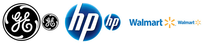
GE – General Electric, HP – Hewlett-Packard, Walmart
Your business logo will be shown and printed on various mediums – company website, T-shirts for outdoor teambuilding activities, your staff’s electronic signature, desk calendars, neon signs, advertisement billboards, promotional items like pens and pencils, etc… Whatever details and design twists you bring into your logo design, regardless of its complexity, make sure it can be seen on a miniature scale. Should you wish to have your logo appear on larger surfaces like billboards, make sure the proportion of the design is equivalent to the original one – this means the tail of the huge sky blue Facebook icon of the letter F cannot be too long or the stroke too wide.
The versatility of your logo design should be well-represented on promotional products. The Swoosh symbol of Nike can be seen in plenty of colors besides white – on socks, sneakers, trainer T-shirts, trainer shorts, caps, backpacks and even bootleg products such as wallets, scarves, and sunglasses. It’s best to consult with a professional marketer or a designer before you put forth a logo design on your products. With … years of experience in customizing logo design, Designveloper can turn the most abstract idea of yours into reality.


